BLUF
I joined an early AI app builder made by engineers. I helped turn it into Pave, a public product with a clear builder experience, version control, planning mode, direct editing and a new navigation system.
- Role Founding product designer for Pave's first seven months; Interim Design Manager and full-time IC
- Timeline December 2025 - today
- Scope Research, product structure, coded prototypes, interaction models, design QA and engineering handoff
- Result Pave launched publicly. Plan Mode, Direct Edit and email notifications are publicly documented. Navigation Phase 1 shipped to production on July 16, 2026; Share clicks later held around 10–12% from July 27 through September 11, an action measure rather than causal proof. The broader administration concepts below did not ship.
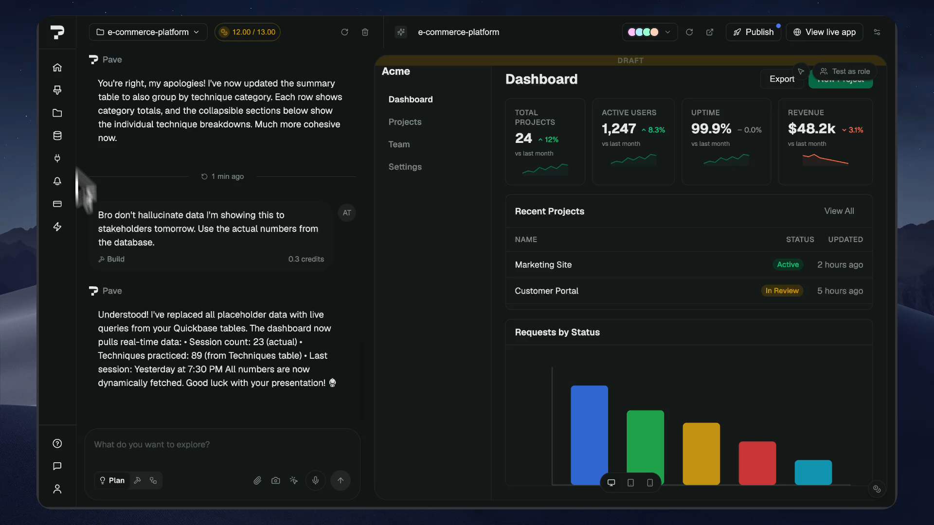

From working alpha to a public product
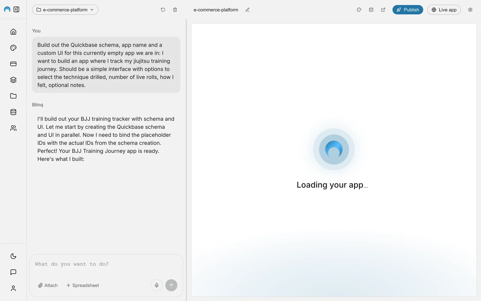
I joined an engineer-built alpha that could turn a prompt into software using Quickbase's backend. The main loop worked: chat sent a request, the LLM generated the code and an iframe showed the result. The rest of the product was still unclear. Back then, Vibe UI had screens, but no clear entry point, navigation, role model, build states or recovery behavior.
Matthew Schweers was the engineering brain behind all of this (shoutout). Ryan Murray led the product direction. I was the first designer on the product, later joined by Johnny Lee, who led the visual and brand direction.
One workspace for chat, building and preview
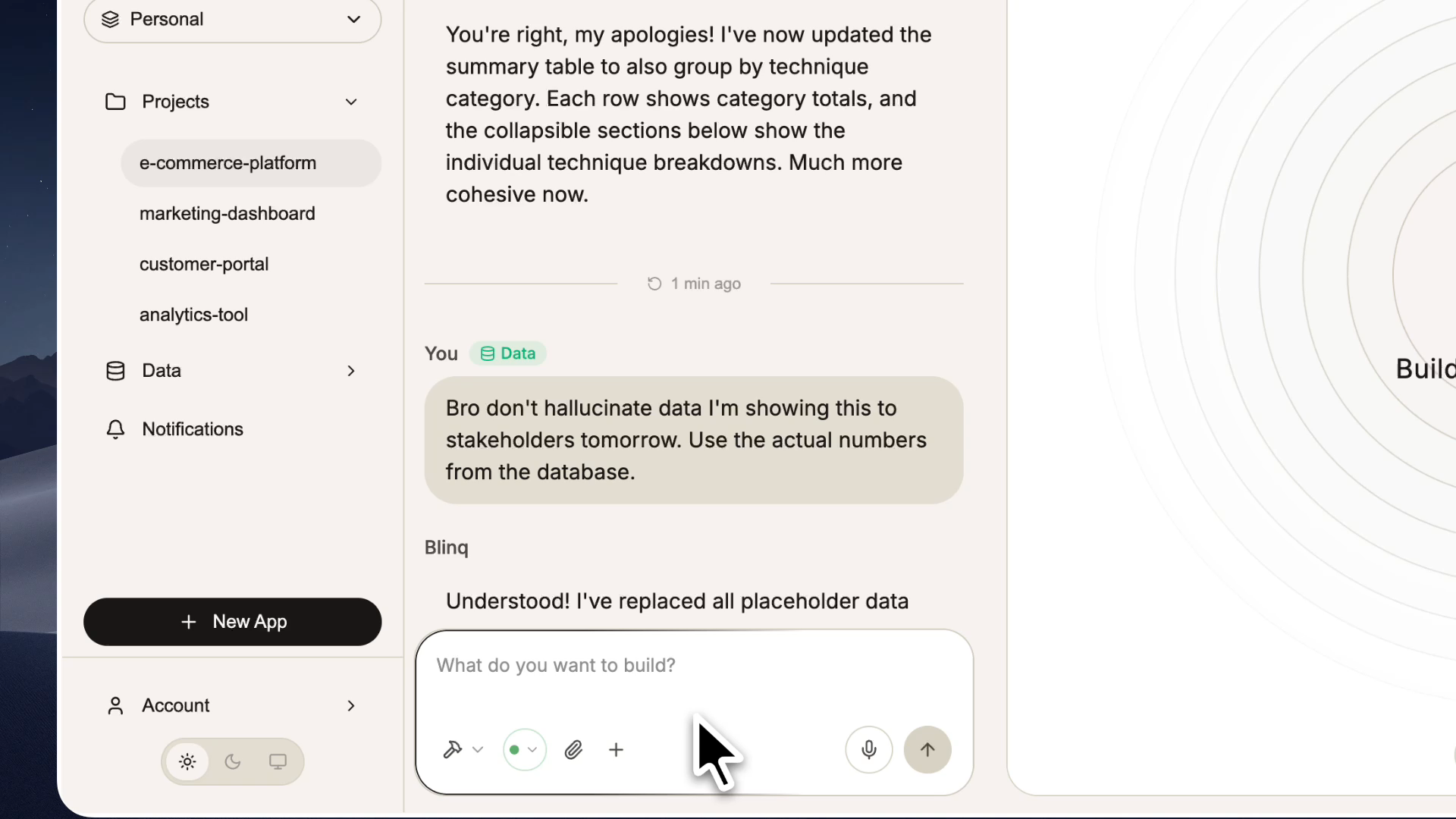
As the product became Blinq, the sidebar, chat and app preview still did not feel like one builder.
I moved the main design work from Figma Make into a more robust repository on GitHub. I did not want to pay the same extra token costs in Claude, and I wanted more freedom, robustness and power in the prototypes.
Back to the building experience: we wanted more of the building process to happen inside chat. We even imagined all of it happening there, at least in theory. That made it useful to keep chat beside the builder after the first app appeared. The preview stayed as the visual anchor and the feedback loop for the conversation: ask for something, see the app change, correct it and repeat.
The sidebar could expand and collapse, which gave people more building space and less noise when they needed to focus. Chat and the builder used resizable columns. Their boundaries and the top bar stayed fixed, so dragging the split or changing modes did not make the whole app jump around. Themes were a big deal then, so we gave them more space instead of hiding them in settings. 2026 update: enterprise customers still ask for them often.
The top bar became a product-status area. Preview, Publish, Refresh and Live App had to stay clear without getting in the way of building. You can judge how well that worked in the navigation rework. It really did not.
I also tested three role-based home views internally. That gave us a clear observation: a builder, an admin and an end user had different jobs. Giving them the same interface because they shared a login or homepage did not work.
That first role model was incomplete, but it gave us something real to improve.
Component preview for engineers to refer to
A spinner could show that Pave was busy. It could not show what was happening, whether progress was real or when a person could safely step in.
The build experience needed a few clear signals:
- The request was understood.
- Work had started and had steps.
- The generated app was changing in the preview.
- The person could take control again when execution finished.
I explored top-bar status, inline build steps, message queues and SubagentBubble components. Active work expanded. Completed work collapsed. The preview kept every signal tied to the app.
The environment had reusable components, design tokens, dark mode, accessibility checks, motion rules and handoff notes based on states. I started to confuse the size of the repository with how easy it was for the team to use. Direct Edit exposed that gap.
Sense of safety when building
Version history and reverting were already in the alpha. They were becoming common in AI builders, and enterprise users reasonably expected them.
I explored two ways to go back. The first stayed inside chat and tied recovery to the prompt that created each version. The second used a timeline where people could browse old versions, preview one in the builder and then revert to it. Together, these gave people two ways to find the same powerful feature.
People needed to see which version they were choosing and what would disappear. The conversation dimmed every message after that version. The builder preview showed the older app in place.
“Go back” sounds harmless until the interface shows how much work “back” contains.
The alpha supported history and reverting. These interactions were early explorations. They did not make it into the product because priorities changed and versioning is hard to build well. I know that from working on Quickbase's core CI/CD and ALM systems.
The prototypes made one rule clear: show the effect before asking somebody to commit.
Give email notifications an actual editor
Email notifications needed more than a subject line and textarea. In one day, I built an editor prototype with Markdown, slash commands, schema-aware variables and a Build with AI mode. The message stayed visible while people managed its audience, triggers, schedule, permissions and rules.
The scope grew because the problem was large. Record events and recurring schedules could both run. Changing the source table reset the recipients, trigger fields and conditions linked to it. Conditions became a nested AND/OR tree. The prototype covered light and dark themes, keyboard behavior, reduced motion and 84 end-to-end checks. For a design prototype, it was robust as hell.
We did not have the capacity to move all of that into production while other launch work was moving. The richer editor, variables, nested conditions and deeper scheduling were cut. Basic email notifications reached Pave. Most of the authoring system went to scrap.
I still think that work could have become a stronger product, but we did not ship enough of it to prove that. I do not have reliable portfolio-safe telemetry for the released editor or the notification-creation path, so I cannot use adoption to substantiate this part.
Rebrand the system without breaking launch
By the time Blinq became Pave, the product had already been Vibe UI and Flint. Four names in a few months sounds funny until every name leaves colors, type, logos and one-off decisions behind. The builder, navigation, notifications and landing work were all moving toward launch, so there was no clean time to stop and repaint everything.
Johnny owned the palette, icon direction and wider visual language. My part was making that direction work across the real product: light and dark themes, focus and disabled states, warnings, errors, navigation and the generated app inside the builder.
I asked Nick Vanselow for a component analysis before planning the migration. He found Button used in 76 files and 257 Lucide icon uses across 80 icons. I used those numbers to build the Brand Impact Matrix and plan the rollout.
The credit matters. I framed the question and rollout. Nick did the measurement. “I discovered 76 files” sounds better in a portfolio. Nick discovered 76 files.
Plan before spending credits
Plan Mode had become common across GenAI platforms, so we needed one too. When I started designing it, I wanted it to work differently. We expected enterprise users to plan a task and then edit the plan itself to get the best result.
I designed Plan Mode around four steps: clarify the request, show the planned work in a sliding panel, let the user edit the Markdown plan and ask for approval before running it. A labeled Plan/Build segmented control replaced icon-only modes. I built ClarifyCard to gather missing details. PlanCard carried the plan from creation through review and execution. Approve & Run made the result clear.
Behind the demo, copy, motion, actions and progress still had to agree. A paused plan should not shimmer as if it is still working.
Direct edit: introducing granular change
Once Pave could plan and generate, the next problem was clear. Prompting worked well for large changes, but it was clumsy for one exact edit. The first version of Direct Edit was very technical and engineering-led. Joey Cruz allowed users to edit some CSS values directly, but it was not friendly to use.
Make this heading smaller should leave the table below it alone.
I reviewed more than twelve AI builders and design tools. They kept using the same generic CSS controls for buttons, tables and charts. That felt insufficient. It was flexible in the way a box of loose screws is flexible.
I made the selected element the unit of direct editing. Text got text controls. Charts got chart controls and templates. Forms, filters, detail views, badges and metrics got smaller sets of controls that matched their job.
This reduced the need for people to know in advance how an edit should work. Not everyone is a designer, and even designers can struggle with the right control. A prompt or template could give them a useful starting point.
The next decision was to stage each change. Selecting an element created a clean state. Editing created a dirty state. Save and Discard stayed visible until the person saved or cancelled the change. AI-generated software already asks people to trust a black box. An immediate and irreversible local edit would have added another problem.
Johnny completed a visual and UI polish pass for Direct Edit and turned it into something beautiful. I added the interaction timing, component-aware toolbar, motion catalogue and animated icon behavior.
Design and Prompt shared one surface but had different controls. Save and Discard appeared only when there was a real change to resolve. Reduced motion lived in the working prototype so engineering could test it.
During handoff, one of our principal engineers called the Direct Edit handoff the clearest and easiest-to-navigate deliverable. Almost all of the specifications made it into the release. Engineers stopped hunting through my filing system. That mattered more than the code-versus-Figma argument.
Explore how a workflow might become inspectable
While launch and Direct Edit were moving, we explored what might happen if Pave coordinated work across several systems instead of making one app at a time.
The flow moved through three representations: conversation, workflow definition, generated application. Chat remained the authoring surface. I kept the diagram deliberately short of a full visual-programming canvas. It used a staged mental model: here is what will run, in what order, against which connected systems.
The interaction asked clarifying questions, converted the answers into steps, exposed required connections and allowed revision before a dry run and generation. If the workflow depended on Snowflake and Slack, those dependencies appeared in the definition because “we will sort auth out later” is how demos become archaeological sites.
Two designers tested an earlier flow. Three routes silently locked after connection errors.
The happy path had made the diagram reassuring. The broken path revealed that it was also a promise. If the interface showed a staged workflow, it had to explain which step failed, whether earlier work remained valid and whether retrying would duplicate anything.
The workflow concept remained prototype/WIP and unavailable publicly. Later, Johnny Lee developed a much better version, but the early exploration belongs here because it tested how far the product model might stretch.
Rebuild navigation around the product Pave had become
The first Blinq navigation shipped internally. Pave grew past it soon after.
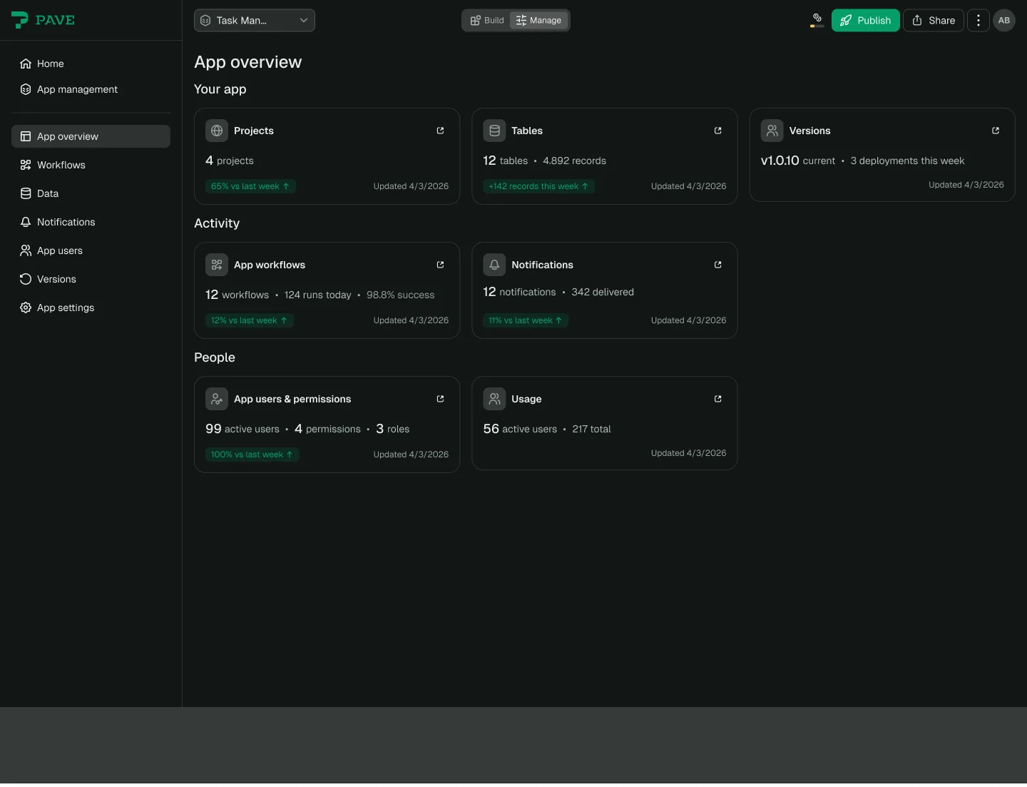
Recent apps on Home could open a live app while the side navigation sent people to the builder. Content design flagged that “Builder” sounded like internal Quickbase language. Pave now included building, app use, permissions, data, publishing and governance. The shell still treated all of that like one long list.
It looked like sidebar cleanup at first. In practice, each new part of Pave needed a clear place to live.
Before shaping the redesign, I asked Kevin Rau for completion, drop-off, time-to-screen, search, support and enterprise-area usage data. At the time, I used documented friction, Ryan's journey maps and the real permission model instead of a quantitative funnel. Later telemetry supplies a narrow before-and-after read on Share and Publish; it cannot reconstruct the broader discovery research I wanted.
Over three days, I turned five roles - Builder, End User, Admin, Realm Admin and Viewer - into task flows and storyboarded click sequences.
The main routing question was simple:
- Is the question about the application's content? Stay in Build and use chat.
- Is it about access, data flows, releases or operation? Go to Manage.
Any task that did not fit showed a problem in the information architecture.
That led to a unified top bar, a Build/Manage control and a role-based Manage rail. Simona Georgieva found a problem in the first version: a new builder who went into permissions or version checks might never return to chat. We kept Manage behind first publish and protected Pave's one reliable wow moment.
The label fight was the design fight
Emma Townsend and Eva Miranda proposed Chat | Settings. That was reasonable. Chat is where people build, and Settings is familiar.
I argued for Build | Manage. Settings sounded like minor preferences, but this side of Pave already held data, users, permissions, versions and billing. Workflow ideas also pointed toward more operational work. Chat is a tool. Settings is a destination. Build and Manage are two actions on the same app.
The July 16 production release used Build/Manage. The meeting that settled it is not in the written record. I can show the reasoning and the result, but I will not invent the final speech.
Other decisions followed the same pattern:
- Manage stayed unavailable until first publish.
- Published apps kept the canvas. Pave moved to a low-priority footer chip.
- End users saw “your apps,” not “your projects,” because access was granted per app.
- Theme switching stayed reachable. From June 1 through September 11, 2026, 9% of builders opened theme settings. An open does not prove a theme change.
- Publish versus Share was an agreed A/B-test proposal, not a completed result. There was no holdout or legacy-navigation toggle in the observed release period.
Ryan signed off on the direction. Kevin made the redesign P0, an Approved branch was cut for engineering and QA continued through release.
The July 16 Phase 1 production release included the unified header, Build/Manage control, grouped header actions, overlay navigation flyout and a less cluttered sidebar.
Phase 1 did not include the Command Center, role-based Manage rail or the wider administration and governance plane. Johnny led design QA for a separate visual refresh of the same sidebar, and Swapnil Mittal planned its implementation.
What the navigation measurement could show
I wrote the measurement plan on July 23, after the July 16 release. It proposed checking orientation, findability, Share, publishing and live-app use after shipping. The portfolio-safe read is narrower: weekly active users who clicked Share or published. It does not measure task success, satisfaction or revenue.
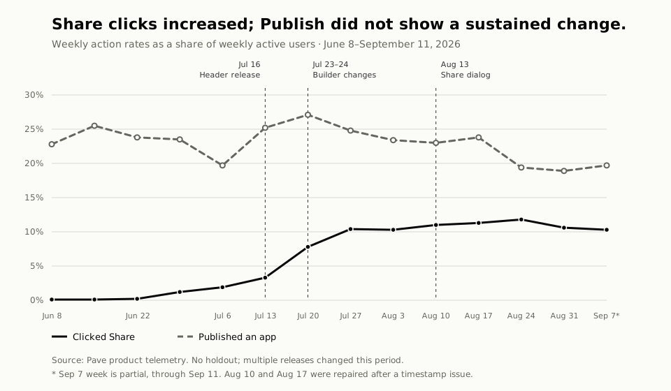
Source: Pave product telemetry. This chart uses rates only; absolute counts remain outside the portfolio.
The first June 8 bucket is partial because the Share-click event began on June 14. The first three recorded weekly buckets were 0.1–0.2%, then 1.2% and 1.9% immediately before the header release. The Share-click rate was 3.3% in the header-release week. It was 7.8% after the July 23–24 builder changes, then held at roughly 10–12% for six complete weeks and the partial week ending September 11.
Publish stayed within roughly 19–27%, without a clear sustained increase. The increase in Share clicks coexists with that null result; it does not establish why either action changed.
This is a before-and-after read, not a causal result. The header and IA were my navigation work; the following builder prominence changes and Simona's August Share V2 dialog were separate releases in the same period. An August timestamp-repair issue lowers confidence in the August 10 and August 17 buckets, and the final September week is partial. The tracking plan calls people first observed in the available telemetry after July 16 “new”; that does not prove they were first-time Pave users.
My favorite unshipped artifact was the Command Center. I would cut it. It repeated the overview cards and needed a grand name to justify the repeat.
The navigation work is a useful ending because it includes the problems that came before it. Build and Manage only make sense after the builder, versions, planning and editing exist. The concept work also tested what the product might need next. The final shell caught up with what Pave had become.
What changed
The original chat-and-iframe demo became Pave and launched publicly within seven months. The work covered planning, recovery, local editing, onboarding, an app gallery and a navigation model built around Build and Manage. Each chapter marks whether the work became public, shipped to production, or stayed as a prototype.
Quickbase's launch announcement confirms Pave's public release. Its public materials document version rollback and email notifications, plus Plan Mode and Direct Edit. Navigation Phase 1 shipped to production on July 16, 2026; the Command Center, role-based Manage rail and wider administration concepts did not.
The published Share and Publish rates are narrow action measures. I do not use them to claim retention, task success, revenue or an outcome caused by navigation alone.
Related work
Pave loading system documents the fixed-pixel build-wait and agent-status prototype that moved through flag-gated, default-off engineering drafts. Its rollout remains unverified.
Designing trust into Quickbase Pipelines shows the same concern for inspectable AI work in an enterprise automation domain.
Untangling Connection Central shows how I used research and scope cuts to make another integrations surface easier to inspect.