Summary
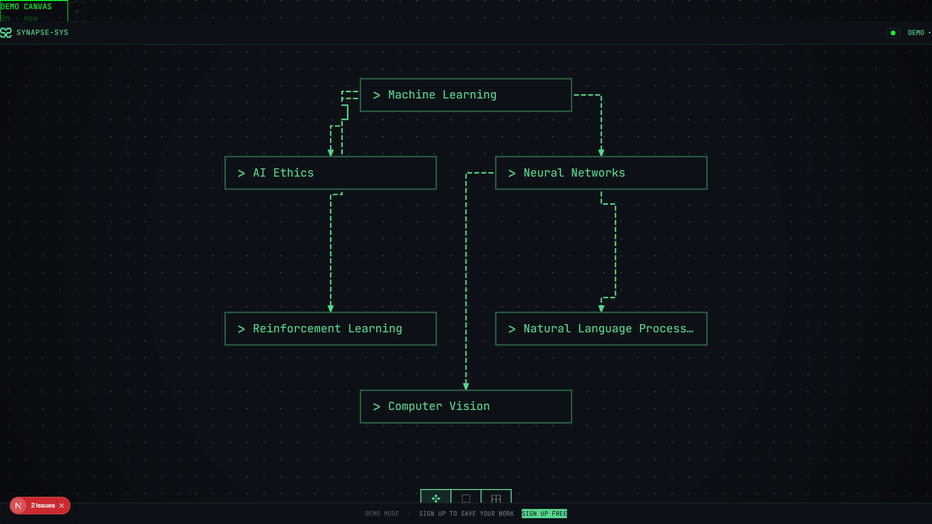
SynapseSys started from one thesis: relationships between ideas should be executable. The first visual answer was deliberately loud. Black canvas, phosphor green, pixel shadows, dashed right-angled edges and a blocktype mark. It proved the product had a point of view. It also glared, put everything at the same volume and risked looking like a toy console instead of a clinical tool.
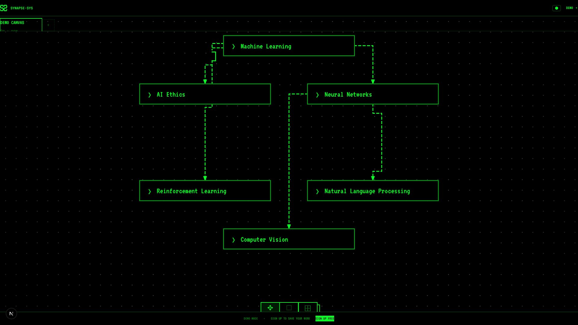
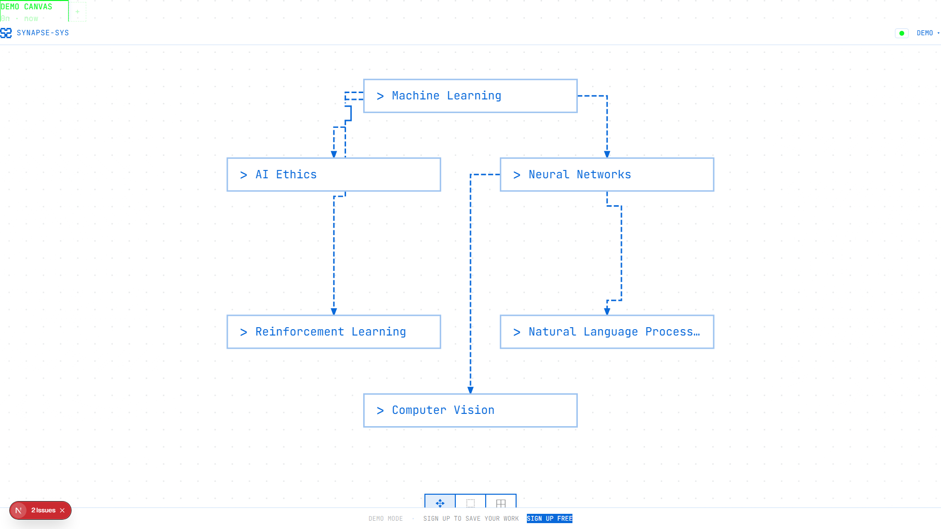
I was the only designer and design engineer, from the visual language and the interaction system to the components and the code. Between 7 March and 1 July 2026 the work moved from expressive to trustworthy: Midnight became the readable default, Terminal and Pip-Boy stayed as expressive modes, and Daylight proved the system could survive a white background. It is still a prototype.
March to July
Start
The foundationTokens, keyframes, terminal UI primitives, auth forms, canvas grid, nodes, handles, right-angled edges, dash animation, side panel, editor and search palette.
7 days later
Node Interactions v2Through 22 Mar: AI actions, the edge system, the app shell, tests, specs, the five-theme system, font switching and the picker.
14 days later
HardeningThrough 29 Mar: schema data, observability, loading states, settings, playground stories and canvas refactors.
7 days later
OperationShimmerThrough 8 Apr: the landing redesign, generation feedback anchored to its source, retry on failed edges and generating badges.
6 days later
Onboarding reworkThrough 11 Apr: edge routing, audit fixes, content-first nodes, trackpad pan and zoom, and a security lock-down.
3 days later
CalibrationThrough 16 Apr: billing provider changes, theme, name and tone calibration, an Editorial theme experiment and the landing sphere.
9 days later
Midnight baselineThrough 24 Apr: canvas polish, streaming, the mobile and touch foundation, multilingual AI, budgets and deployment guardrails.
16 days later
Edge-operation hardeningThrough 1 Jul: analytics, operation picker race fixes, AI connection fixes, waitlist gating and demo overlay updates.
Avoid AI slop without becoming a terminal skin
AI product visuals have become easy to fake: soft gradients, floating cards, glowing chat boxes, fake dashboards. They look expensive for one screenshot and interchangeable by the second.
I wanted SynapseSys to feel authored. It is not a chatbot with a canvas attached. It is a thinking surface where relationships become operations.
So the test was never "does it look cool?" It was whether a user could still read the map after the first impression faded, whether AI output felt like material on the canvas, whether motion showed what changed, and whether the look held across auth, pricing, settings, sharing, errors, onboarding and mobile.
The last check was light mode. A terminal-only product can hide weak hierarchy behind glow. A real visual language keeps working when the background turns white.
Admit the first direction was too loud
The first coherent direction was pure terminal. The 7 March commits laid it down in one go, from tokens and keyframes to the Konva dot grid, node cards, right-angled edges, the edge menu and the command palette. SynapseSys had an identity on day one.
It also had three problems. Green on black was memorable and hot to read for long. When every element speaks in the signal colour, nothing is more important than anything else. And a clinical AI product can't look like a toy hacker console while it asks people to organise important thinking.
A 23 March UX architecture audit said it plainly: a strong, coherent terminal look, with demo guidance, broken theme rendering and raw error states flagged as trust gaps.
Identity had landed. Trust had not.
Take references from what was built
There was no moodboard in the repo, so the honest reference set is the behaviour that shipped into the prototype:
- Terminal CLI: command language, cursor rhythm, boot sequence, mono labels, square controls, operation badges.
- CRT phosphor: scan rhythm, glow decay, decrypt text, an active idea as a signal turning on.
- PCB diagrams: right-angled routing, bridge arcs, port selection, dashed lines, no smooth curves by default.
- Clinical software: restrained colour, dense surfaces, clear status, trustworthy auth and billing, less decorative motion.
- Blocktype: the logo, shadows, node cards, badges and panels share one hard rectangular grammar.
SynapseSys sits between worlds. It is a clinical AI product, but the core interaction is spatial, generative and weird. It needed enough machine character to be ownable and enough product discipline to stay credible.
Tune type, colour and density for long sessions
Early type leaned on terminal fonts. Later theme work kept the terminal modes in family but let product surfaces use JetBrains Mono where reading mattered.
Colour went the same way. Terminal green stayed the brand signal, but Midnight became the default: a dark, readable background, softer green, quieter borders and enough muted text for secondary information. Daylight used blue as the accent, which proved the graph vocabulary could translate.
Density is part of the brand. This is a canvas tool, not a landing page: thin top chrome, small uppercase labels, compact toolbars at the canvas edges, grid dots for orientation, node cards sized for scanning, and side panels that keep their structure without swallowing the canvas.
Spacing is mechanical on purpose. Controls sit in rows, edges turn at right angles, shadows are offset blocks. The metaphor is a machine arranging ideas, not a lounge.
Let the playground catch failures early
The /playground page became the lab for the visual system. It grew across commits like 012475b (themes, settings, playground stories), cbb16bc (the animations showcase), 3309c55 (OperationShimmer), 680fe2c (sphere presets and live tuning) and 0357c62 (wider design system coverage).
It covered UI primitives, every node state, canvas chrome like EdgeMenu and EdgeOperationPill, layout and overlays, onboarding and loading, and the landing motion experiments.
Volume wasn't the point. The playground let taste fail in small places before it failed in the product: wrapping bugs, contrast misses, over-animated loading, menus that felt like decoration, ghost nodes that felt too permanent, and themes that worked in CSS but not in the Konva canvas tokens.
Make motion explain product state
The motion docs set three timing tiers:
quick: 100ms for handles, tooltips and button statesstandard: 200ms for mode swaps, chip entry and dropdownsemphasis: 350ms for node creation, panel entrance and viewport motion
Fast, snappy, slightly mechanical. The default curve doesn't ease. It snaps.
I treated animation as a contract per component, not a sitewide effect:
- BootSequence: the blocktype logo drawn in reverse, the offset shadow, the fill, decrypt text and CLI progress, then the canvas.
- Canvas and grid: the dot grid, ripple, pan and zoom, and a remembered viewport make the canvas feel like stable ground.
- NodeCard: drag lift, pixel shadow, focus ring, edit and view swaps, resize handles and content-aware height keep cards physical.
- ConnectionPreview: handle proximity, snap targets, a right-angled preview line and a snap radius that holds at any zoom.
- EdgeShape: dashed operation paths, hover dimming, selected priority, bridge arcs and the result tethered to its source.
- OperationShimmer: each AI operation gets its own wait: expand bursts outward, synthesize crystallises, summarize backspaces, compare splits.
- GhostNode: suggestions stay provisional and only animate into real nodes when accepted.
- ThemePicker: hover previews update CSS variables and canvas tokens together, because Konva edges can't rely on CSS alone.
- The shell: Navbar, ModeToolbar, SidePanel, SearchPalette, toasts and auth forms reuse the grammar but stay quieter than the canvas.
When AI generates something, the interface shouldn't just say "loading". It should show where the result came from, which operation is running and when provisional material becomes real.
Some components got better with less motion, not more.
Treat edges as the product
A connection in SynapseSys is a readable relationship, a command target, a pending operation, a result path and the source of the next piece of work. A straight line wasn't going to carry that.
So edges got right-angled paths, selected priority with hover dimming, bridge arcs at crossings, operation labels at meaningful midpoints, dashes that imply active work, and strokes and hit areas that hold at any zoom.
One routing direction looked brilliant: PCB-style staircase fan-out through shared ports. Dense maps looked engineered. They also collapsed into one thick bundle where no relationship could be picked out. The chosen route spends more space so each edge stays selectable, labelled and readable.
Keep AI suggestions as ghosts
AI suggestions are useful until they become clutter. If every related concept turns into a permanent node, the graph stops being the user's. It becomes AI debris.
So suggestions became ghost nodes: visible, near the selected idea, joined by a faint line, and not committed. Accept one and it materialises. Ignore it and it disappears without a trace.
That one decision brought real state work: caching suggestions per source node, tracking ghost anchors, placing ghosts around the selection, nudging nearby nodes without moving them for good, materialising accepted ones optimistically and panning just enough to reveal the new branch.
AI should widen the user's peripheral vision, not take over the map.
Give each influence a job
Retro gives the product memory. The blocktype mark, green signal, square borders and CLI motion make SynapseSys recognisable before anyone reads the pitch.
Modern gives it discipline. Auth, settings, pricing, billing, sharing, export, usage limits and errors can't be art direction. They need hierarchy and boring product trust.
Terminal gives it agency. Operations have names, loading looks like work, and the user is driving a system rather than asking a mascot for help.
Blocktype gives it structure. Logo, shadows, nodes, badges and panels share one rectangular weight, so the canvas reads as a map of discrete objects you can act on.
Cyberpunk for its own sake would have been easier. So would minimal SaaS with a green accent.
Read the old line honestly
The old alextraykov/synapse-sys repo shows a simpler arc: terminal whiteboard theatre that slowly grew graph-product controls without losing the green-on-black identity.
I replayed seven checkpoints from main. The first, ee22f361 from 17 January 2025, wouldn't even render: the CRA app was missing public/index.html. The source still shows the first answer, terminal-style nodes on a whiteboard, before there was enough chrome to behave like a graph tool.
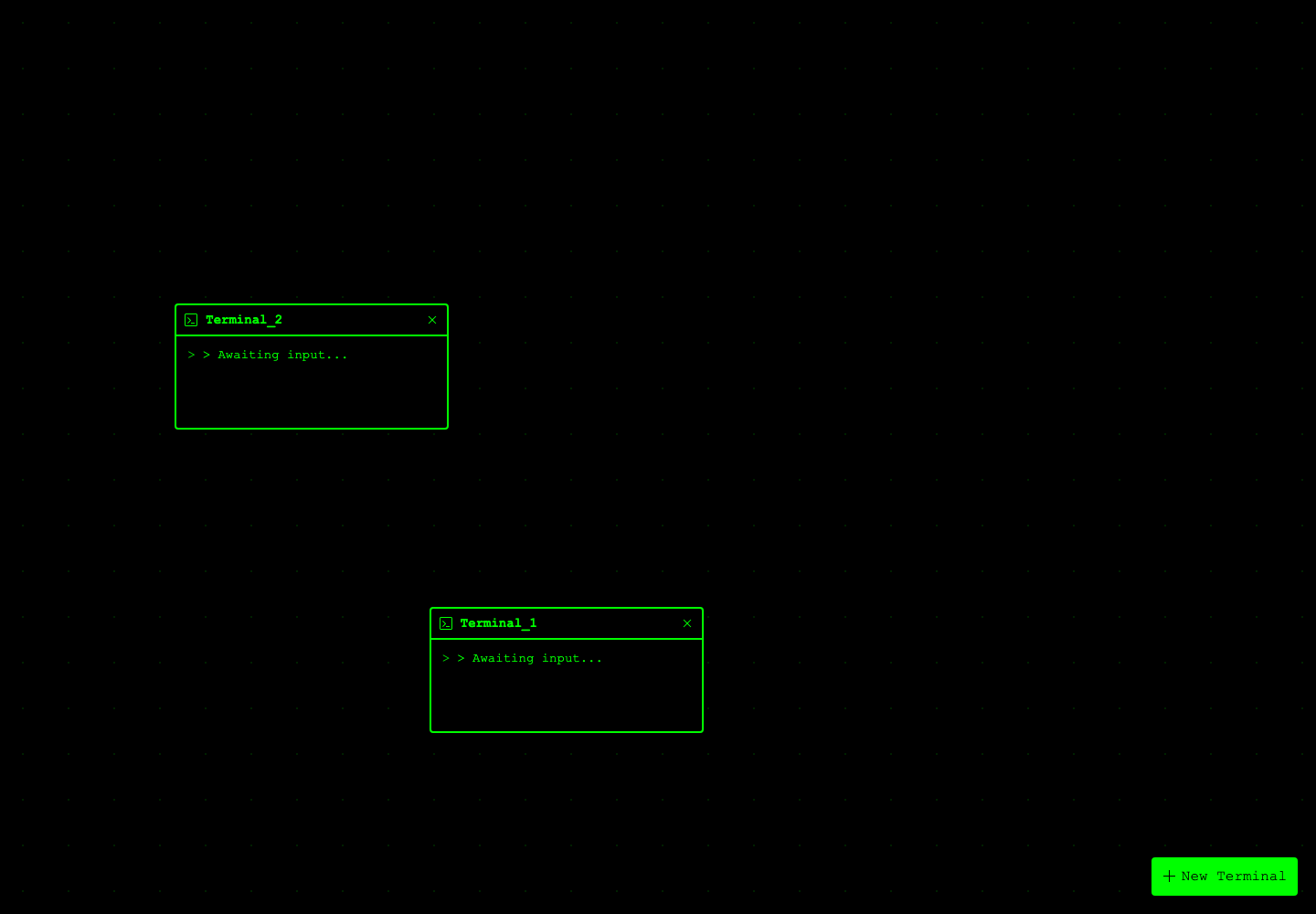
e95e104fterminal-window cards, green dot grid, + New Terminal, and HackerNoon-style icon affordances made the product feel commandable before it felt mature.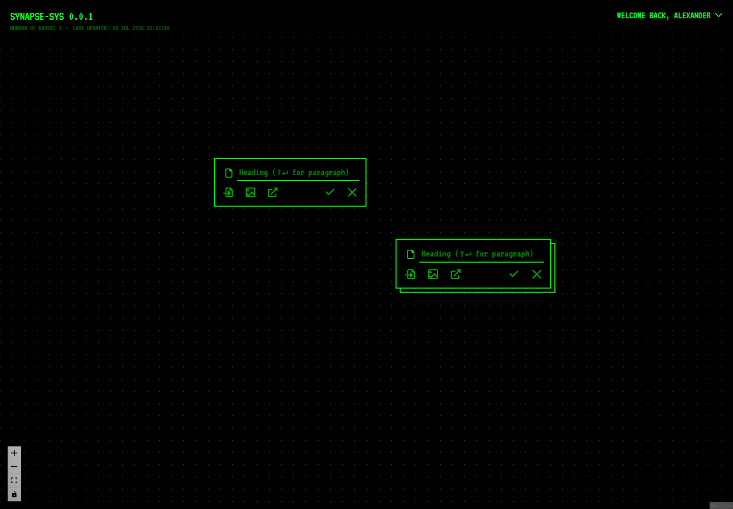
a67ccfe7ReactFlow chrome, connection labels, node action rows, and animated routes made relationships look like product objects rather than decorative lines.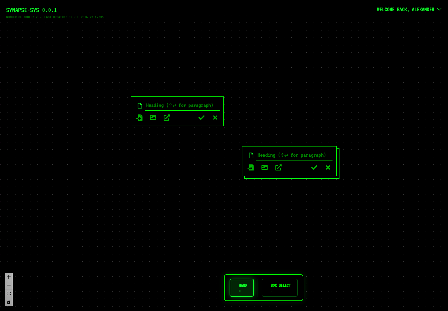
7ff568d3the toolbar named modes directly: hand, box select, action states. The UI became more legible, but still explained itself loudly.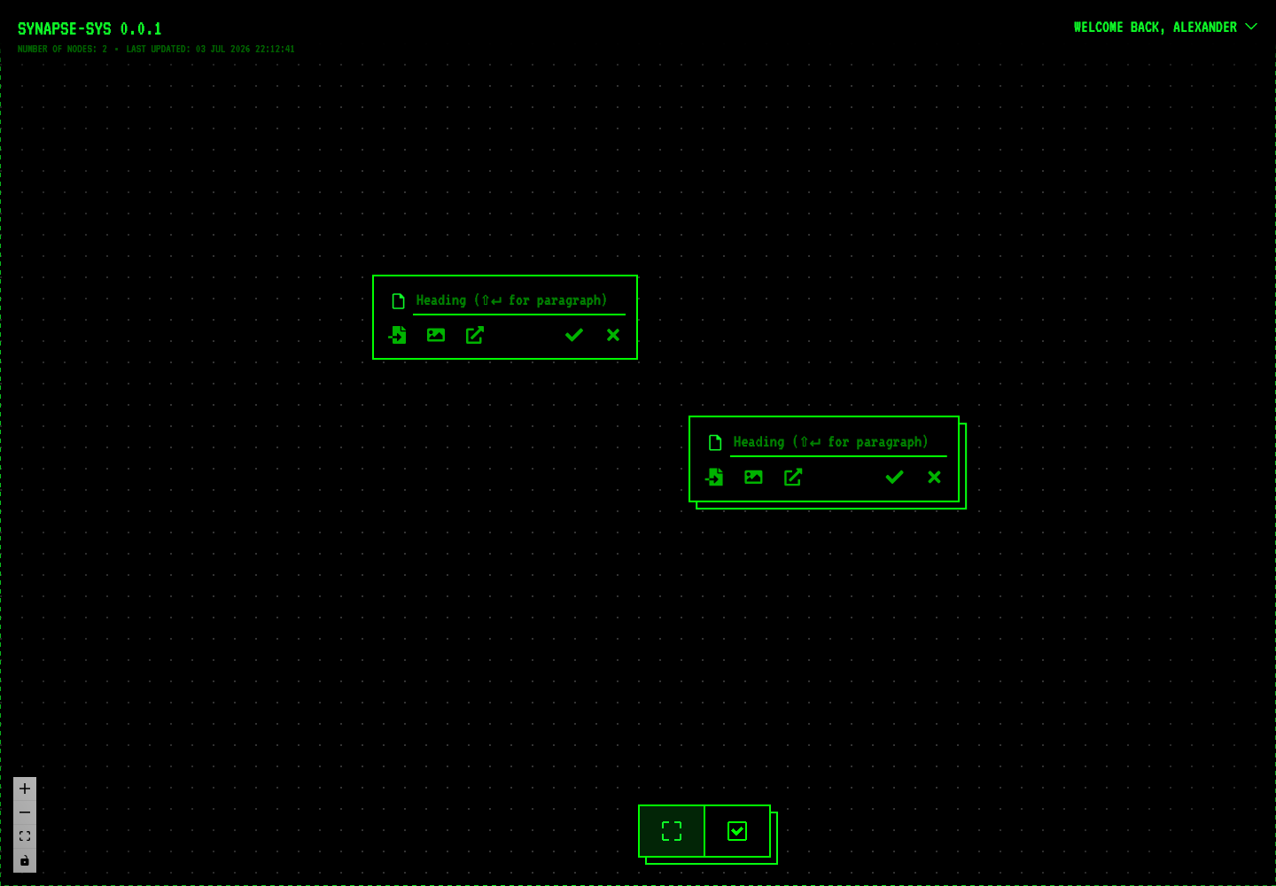
a414bc9flabeled mode controls collapsed into icon-first toolbar language. It became denser, less tutorial-like, closer to real tool chrome.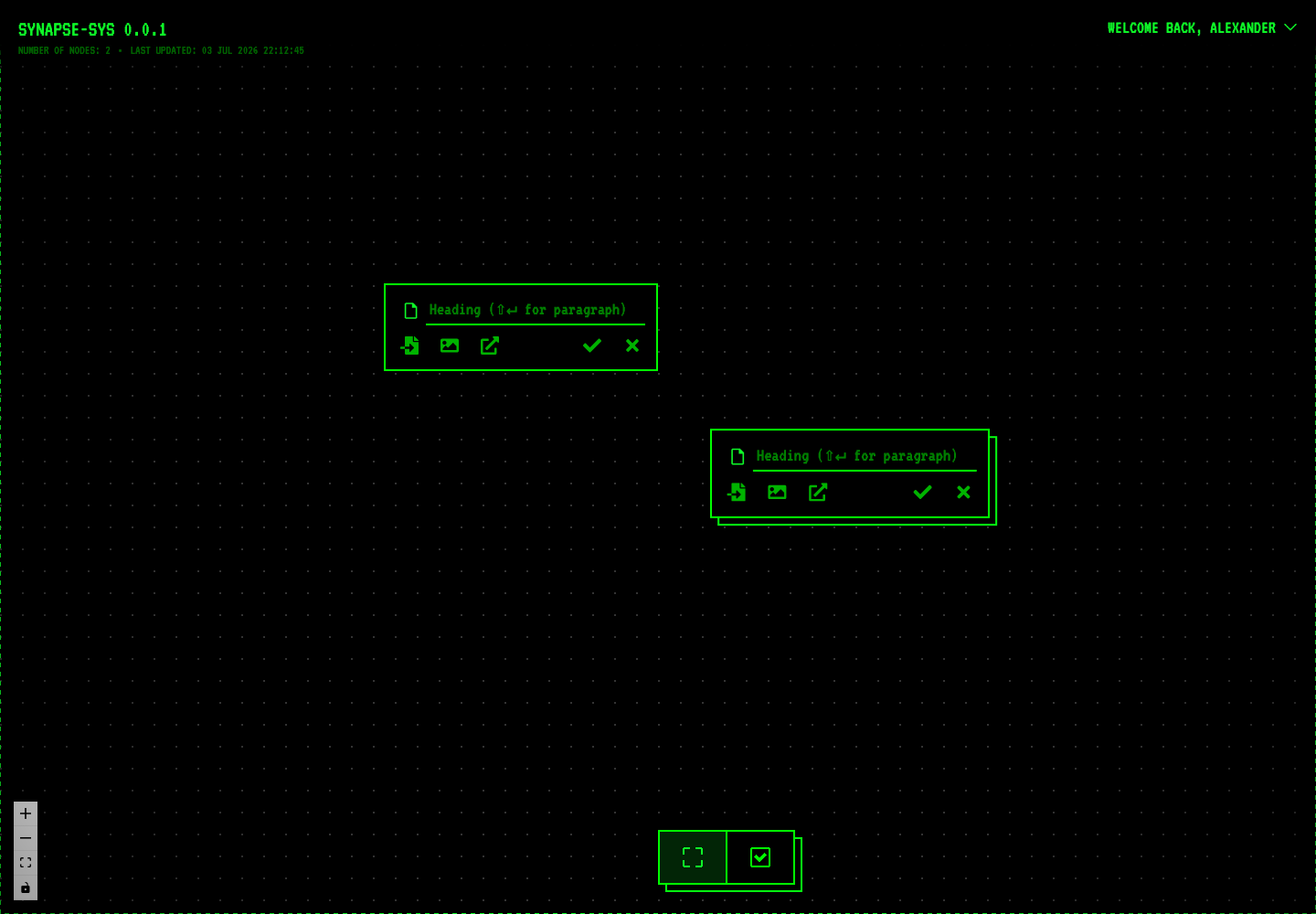
d92cc2e5visual system stayed almost unchanged while canvas ripple performance moved from 35s LCP toward usable load. Taste had to survive implementation cost.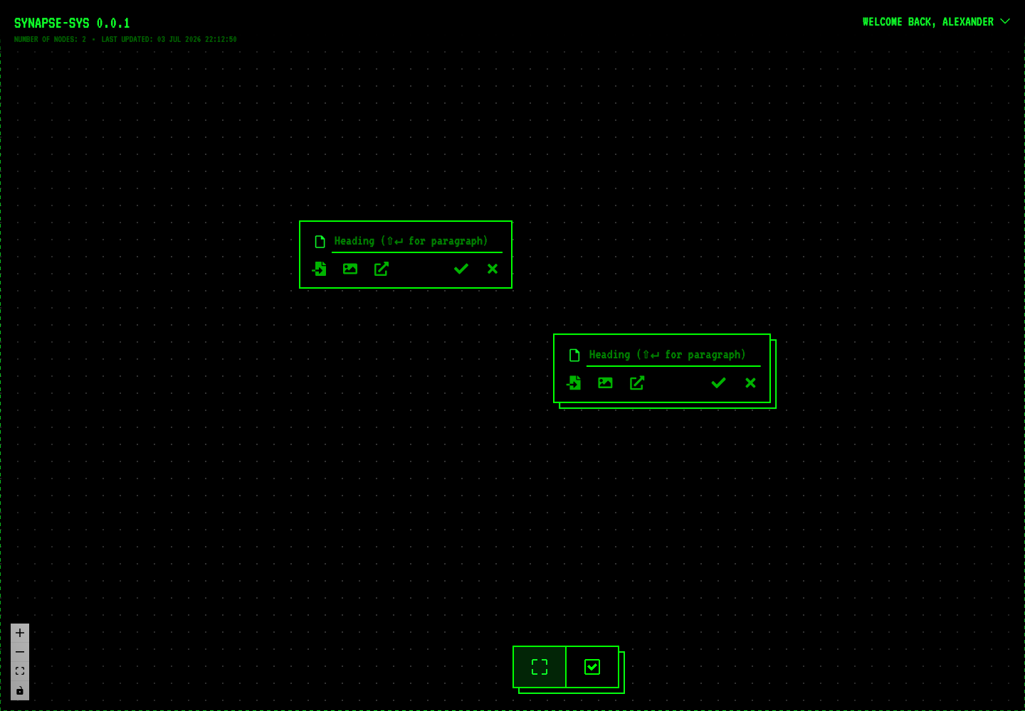
0734c853old main stabilized as green terminal graph surface: expressive, recognizable, high-contrast, but not yet clinical enough for long-session trust.SynapseSys already had an identity before the v2 pass. What it lacked was restraint. The later work didn't need to invent a brand. It needed to lower the glare, protect authorship and turn a loud prototype into something a person could think inside.
Make the look fit the product
The grid implies space. Node cards imply objects you can move. Edges imply relationships you can run. Badges record what happened. The theme system says this is a product, not a one-off demo.
Most of all, the design protects authorship. Ghosts aren't permanent until accepted, pending states aren't treated as truth, AI loading stays tied to its source, and edges stay readable when the map gets dense.
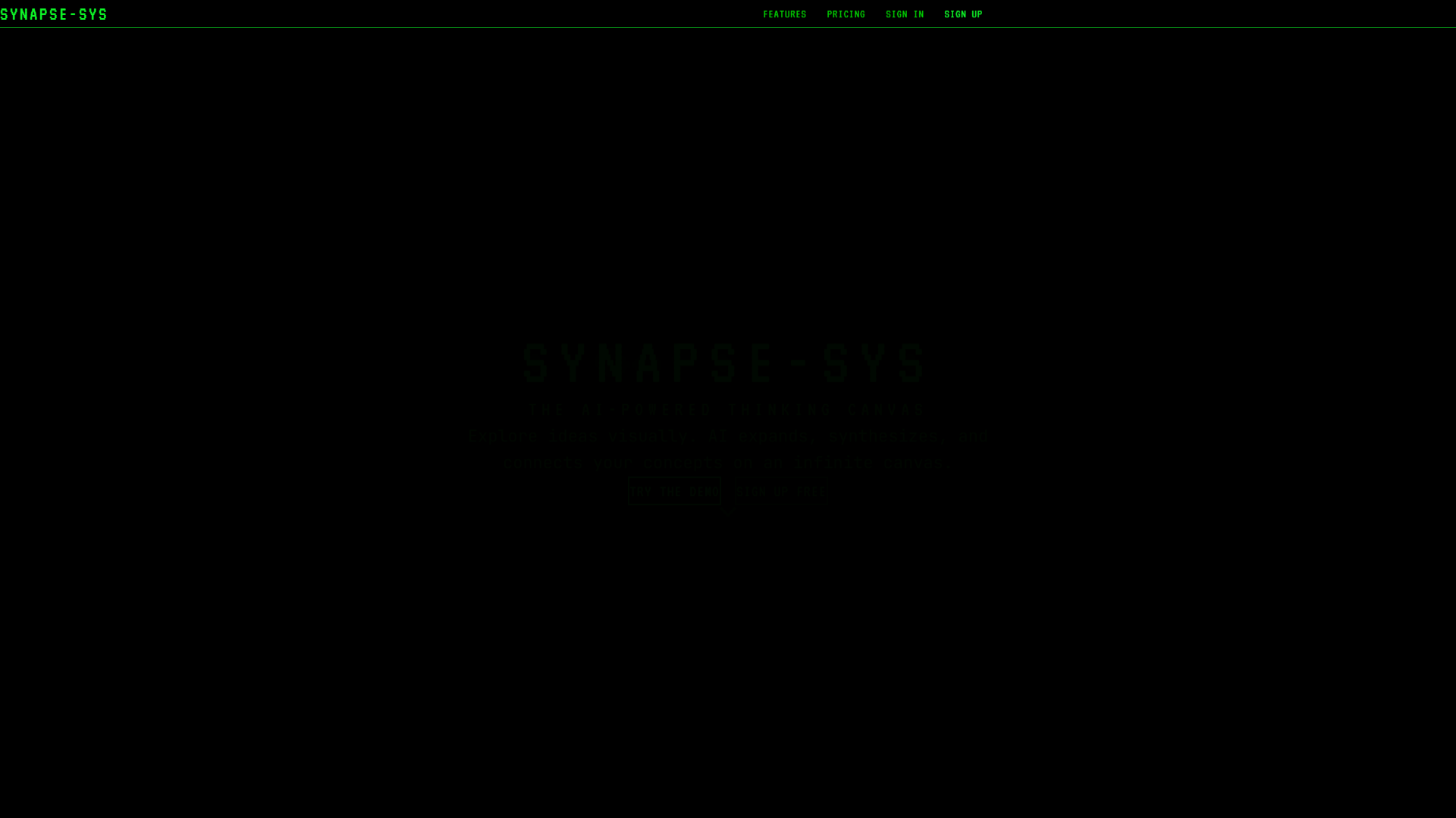
My own landing page was the cautionary tale. The hero had the right tone, and its first words disappeared into the dark on load.
What is still rough
The identity is strong. Onboarding, component density and the mobile canvas are not there yet. The demo can still open as an empty, unexplained machine, mobile needs to be rebuilt around gesture confidence rather than a shrunken desktop canvas, and raw failure states (expired links, auth recovery, budget limits, provider and AI errors) still need designed replacements. Midnight could be calmer, too. The next version should have fewer effects and clearer hierarchy, with the same unmistakable machine.
In short
SynapseSys is about taste under implementation pressure. I didn't just pick a palette: I shaped themes, graph geometry, loading states, component behaviour and landing experiments, then kept turning the volume down until the product could be trusted. The terminal got it noticed. Restraint made it usable. AI can help generate, but the user still owns the map, and taste is the sequence of choices that keeps the screenshot useful once the product becomes real.