Pave's new look
Summary
In late September Pave by Quickbase had two problems at its front door. The home page put a gradient behind the prompt that looked like every other AI tool, and light mode was so flat that panels disappeared into the page. Product leadership wanted light mode to become the default before a marketing push.
I designed both at once, in code, and handed engineering decisions it could build in days. The blueprint home merged within a day of engineering's first commit; light mode went from handoff to merged in under a week. Both went live for every Pave user in one release on 15 October, and the next morning the marketing site moved onto the same sheet. For the first time since launch, the website and the product looked like one thing.
- Role
- Lead product designer and design engineer
- Made
- Audits, coded prototypes, a pitch deck, Figma specs, tested patches and verification
- Credit
- Designed by Alex Traykov. Implemented by Austin Colcord. Marketing site by the Quickbase web team
- Live
- 15 Oct 2026, for every Pave user
quickbase.com/paveThe marketing site runs on the same sheet. Sign in from there and you land on it inside the product.
How it landed
That's reception, not a measured result. Nobody has run a before-and-after on sign-up or building yet, so I'm not claiming one.
Twenty days
Start
Light mode auditThe signed-in pages captured and scored, in light and dark.
Next day
Light mode pitchedA deck running on the real interface, shown to product leadership.
2 days later
Home brief resetThirty coded directions follow, each one tunable live in light and dark.
Next day
Blueprint pickedProduct leadership chooses one direction.
3 days later
Light mode handed offFigma frames, a token map, acceptance criteria and a tested patch. Engineering starts the same day.
4 days later
Blueprint mergedFrom my coded prototype and patches, within a day.
2 days later
Light mode mergedEvery screen, light and dark.
Next day
Build auditedEvery main page measured against the spec.
6 days later
Live for everyoneBoth, in one release.
Next day
Website followsquickbase.com/pave moves onto the same sheet.
The blueprint
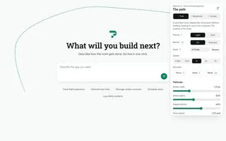
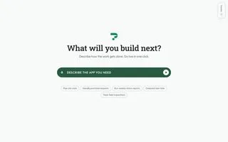
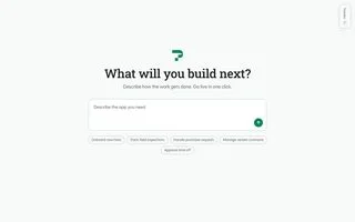
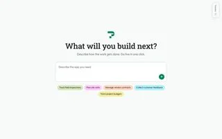
The gradient said "AI" without saying what Pave makes. So the brief became: the background shows what Pave builds (tables, forms, workflows, connectors, portals) drawn the way a draftsperson draws them, and always quieter than the prompt box. I explored thirty coded directions before product leadership picked one.
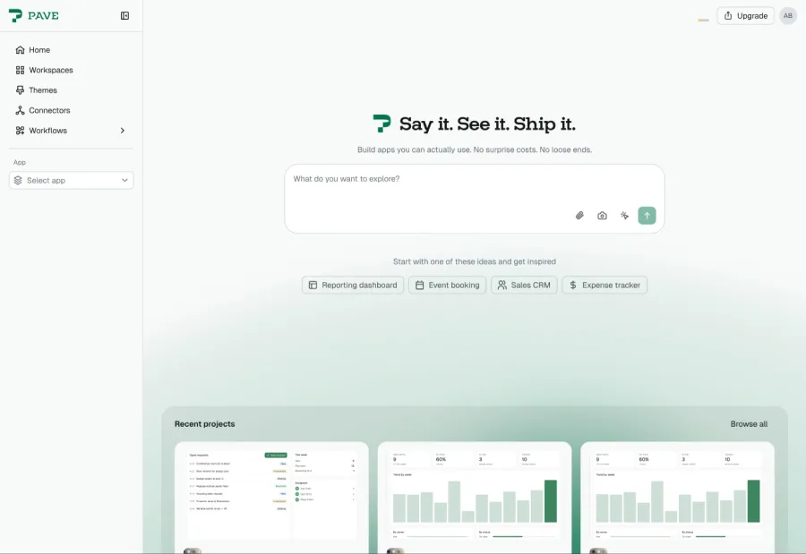 Before: the gradient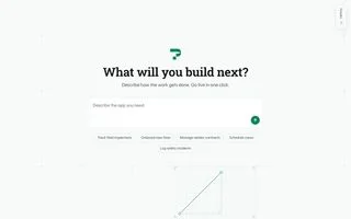
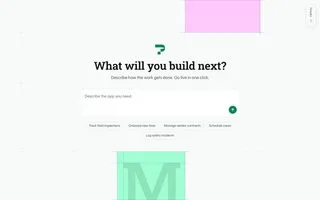
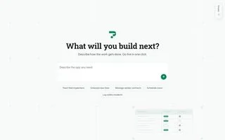
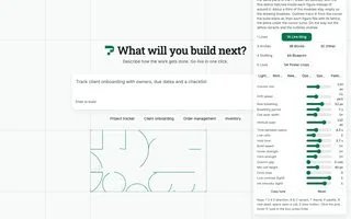
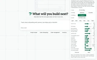
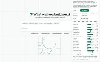 Tiles and blocks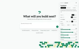
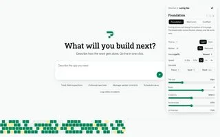
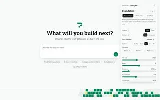
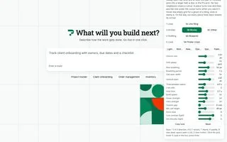
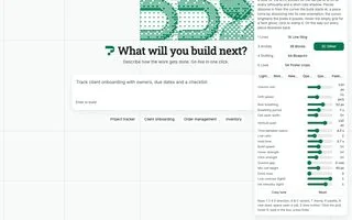
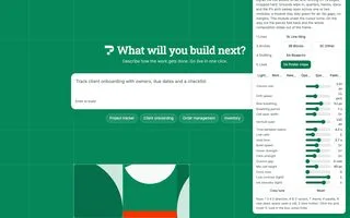 Paths and quiet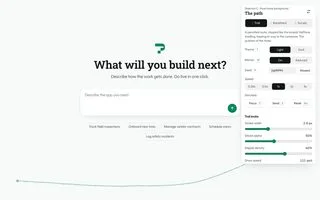
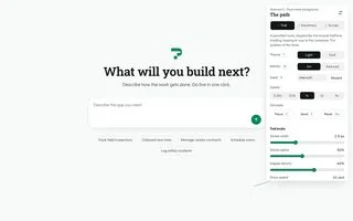
 Loud colour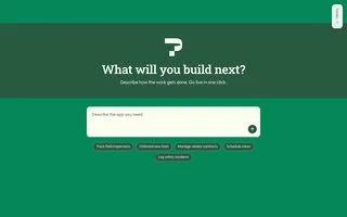
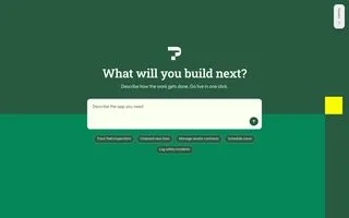
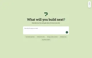
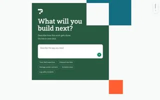
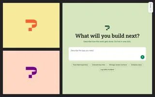
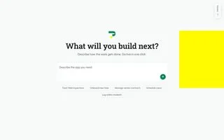 Daylight and poster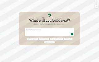
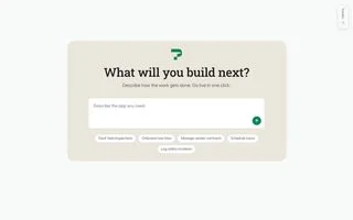
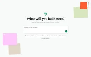
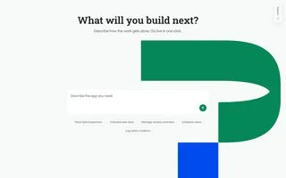
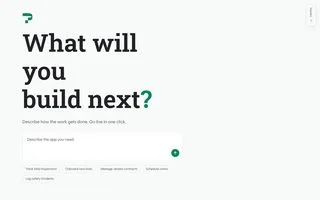
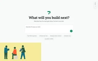
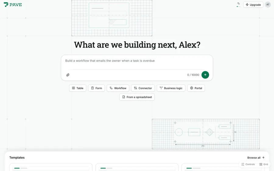 15 Oct: the blueprint, live
A generative background has one job it must never fail: don't clip a drawing or open a cell under the prompt box. Early on, no sampled cell passed. I built an audit that scores every open cell on five checks and wrote layout rules until every cell passed, on desktop and phone, inside the frame budget at four times CPU slowdown.
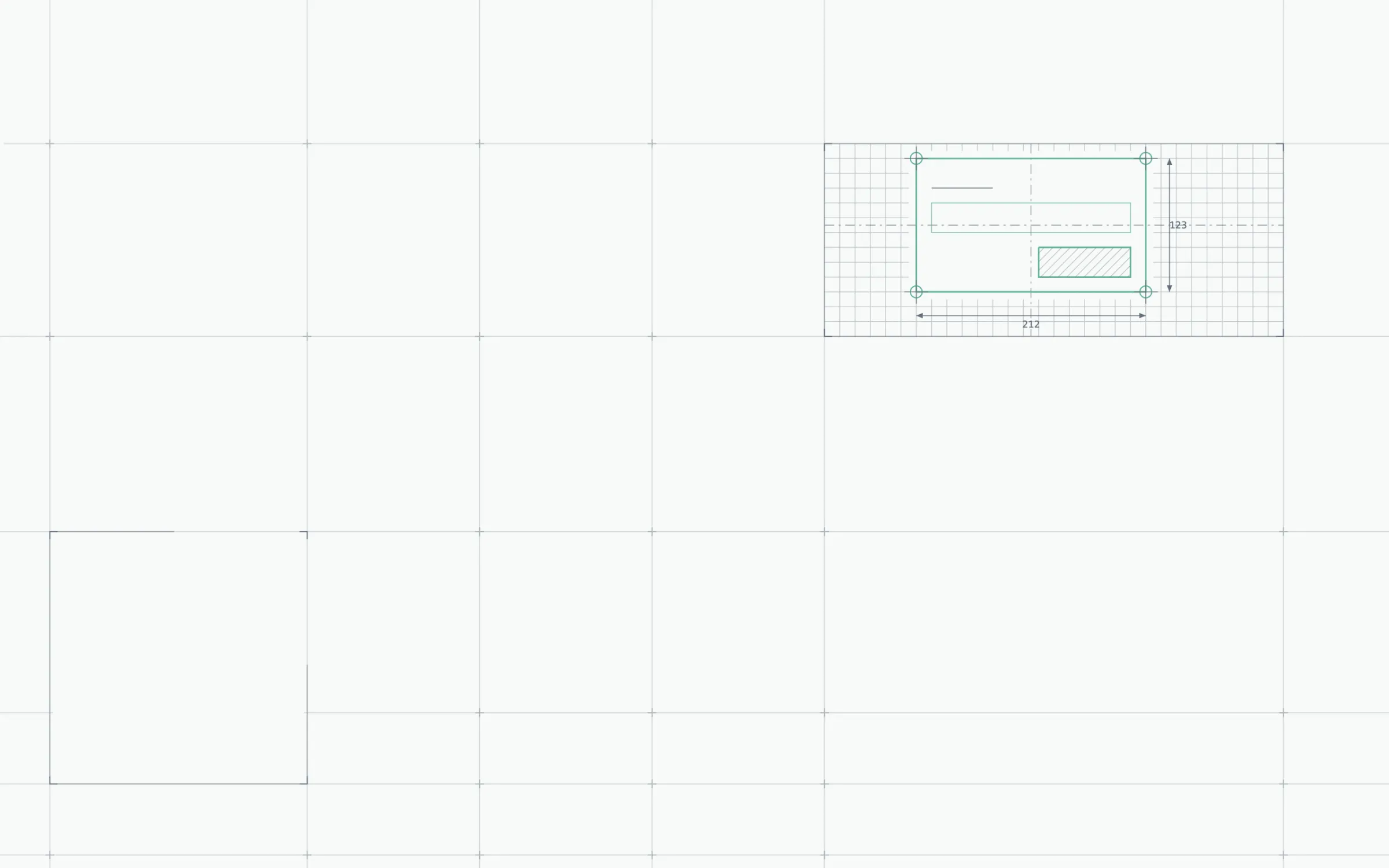
There was no Figma file for the handoff. Engineering got the running prototype and my patches, ported the engine line for line and merged it within a day. The same sheet went behind sign-in and the account and error pages, so nobody signs out of a polished builder onto a page that looks like another company.
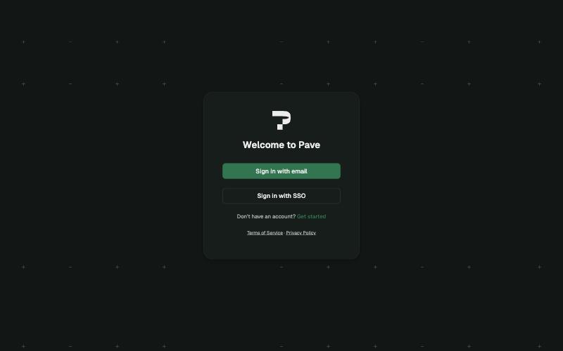
Step oneLiveThe live sign-in: a "Welcome to Pave" card on the blueprint sheet.
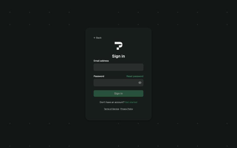
Step twoLiveEmail and password on the same sheet.
Light mode
The finding was small and a little embarrassing: every surface was the same tone, so nothing looked higher than anything else, and the green sidebar was the loudest thing on screen. It didn't need new colours. It needed an order.
- Background
#f1f3f5in light#111715in darkThe frame, sidebar and chat - Raised
#ffffffin light#161d1bin darkPreview pane, page tiles, tables, the composer - Floating
#fcfcfdin light#272a29in darkMenus, popovers and dialogs
Three rules carry it: the composer is the only white object in the chat, there's one green button per page, and in dark mode a higher layer is lighter.
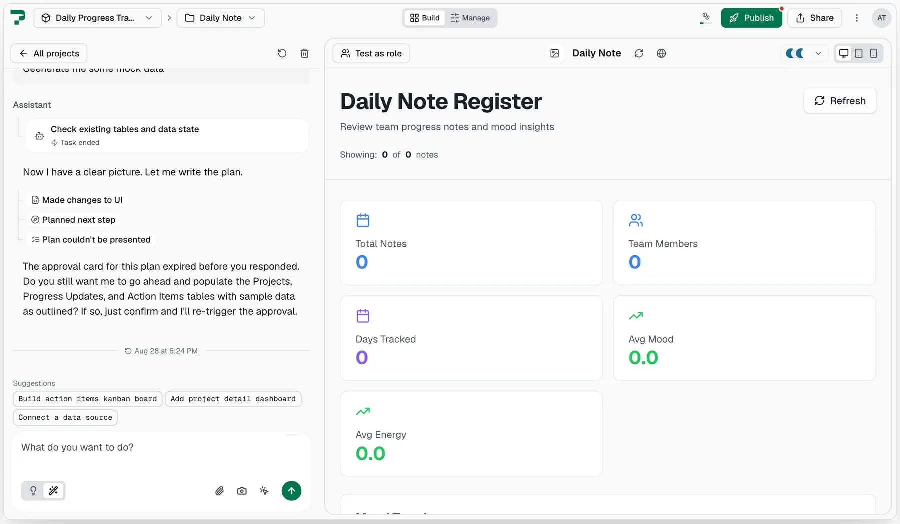
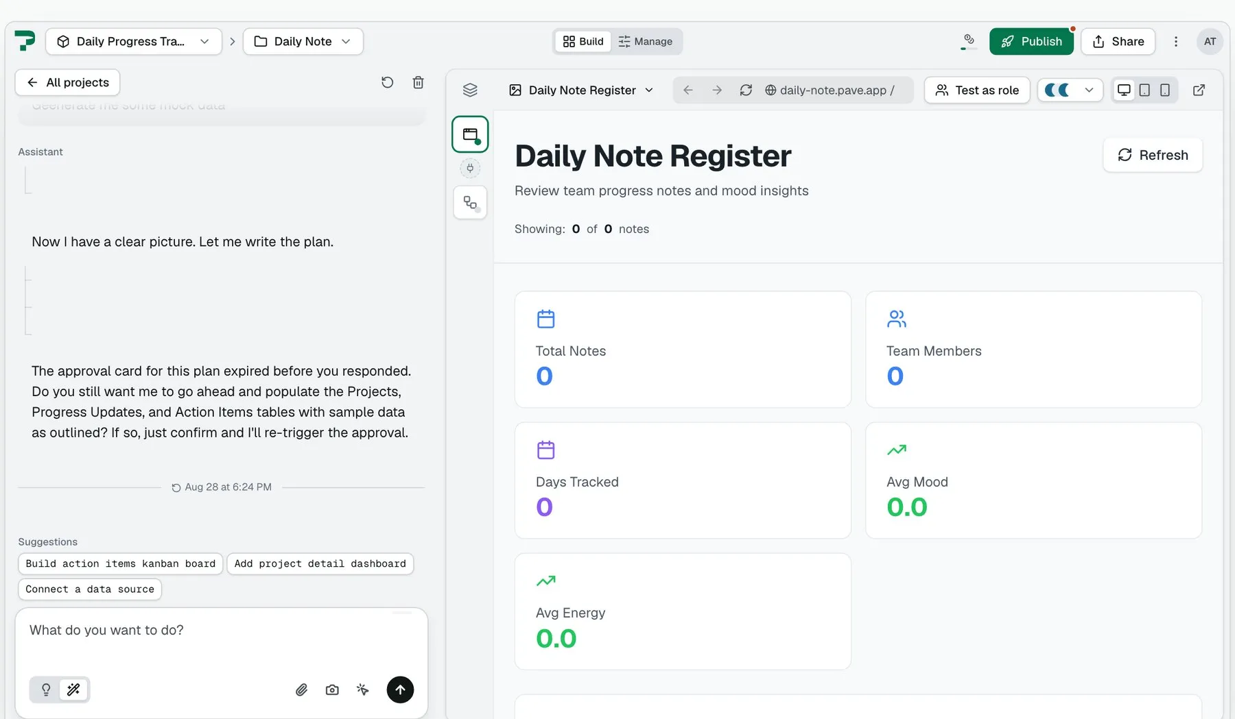
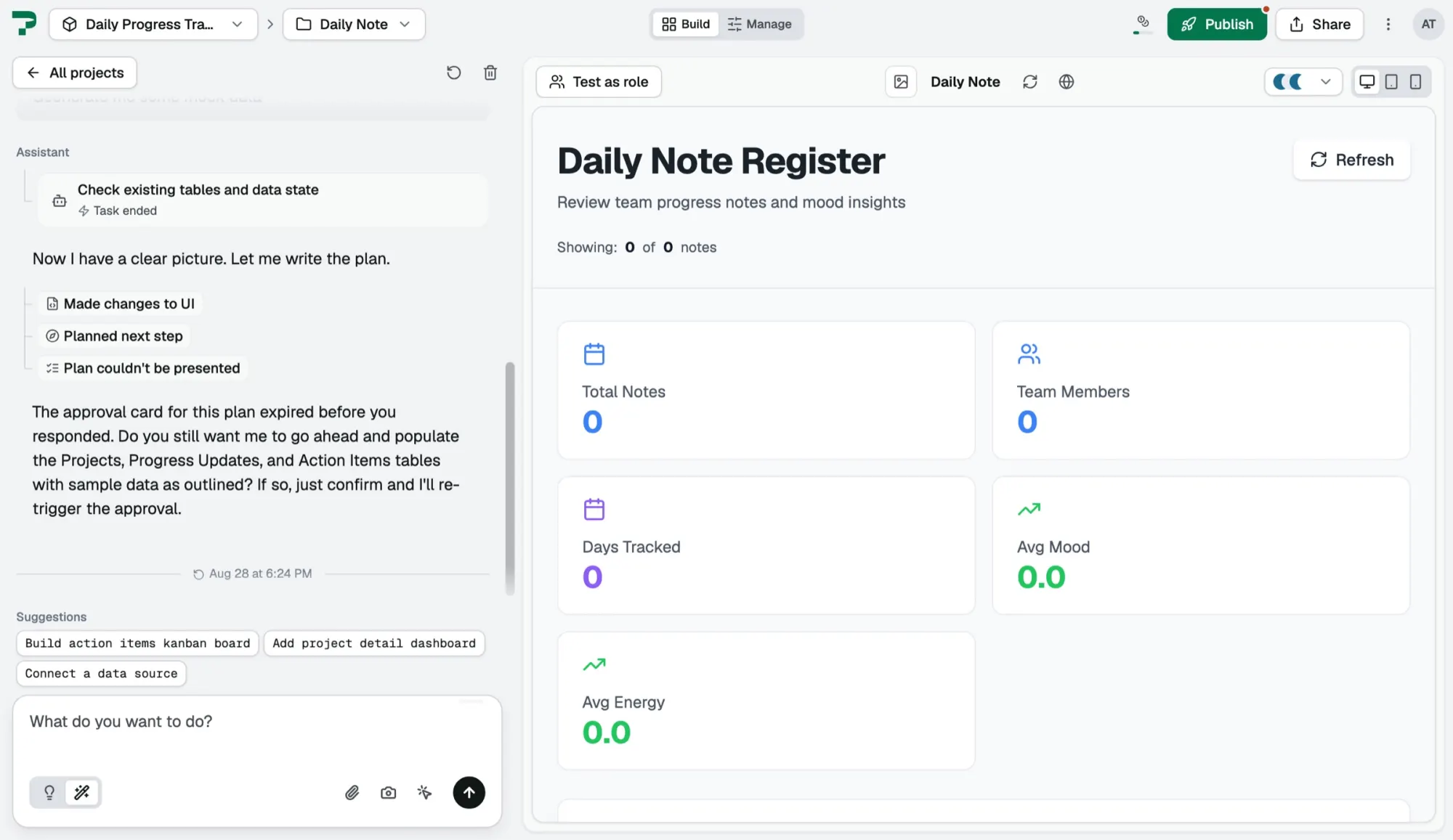
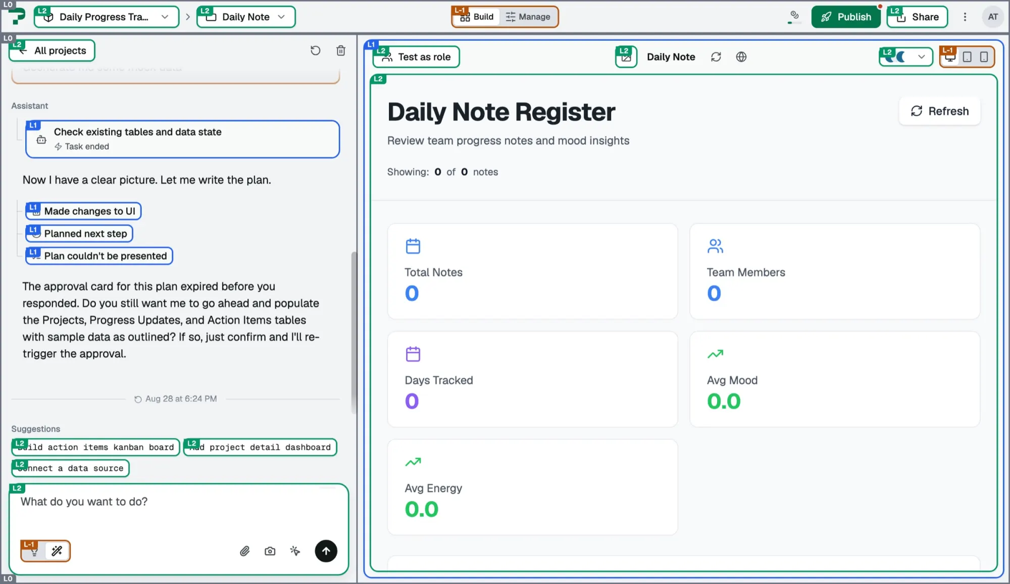
I pitched it as a deck that runs on the real interface rather than on screenshots: every before-and-after lands on today and changes only when you press it, and one slide pulls a lamp cord into dark mode.
My first handoff still carried recommendations next to open questions, and engineering rightly asked for decisions instead. I made every remaining call the same week, and the package became Figma frames, a token map, acceptance criteria written as visual checks and a patch I'd tested locally. Engineering merged it within a week.
One release
Running two redesigns at once had one real cost: the blueprint file and the light mode file drew the sidebar differently, and engineering had to ask which was right. I dropped the frosted variant and folded the blueprint's card into the raised layer, so one system now covers the front door and the builder.
The day after the merge I measured the build against the spec on every main page, not only the ones with a design to compare against. It scored 8.0 out of 10, and the gaps were mostly pages I hadn't drawn. Product took over that list.
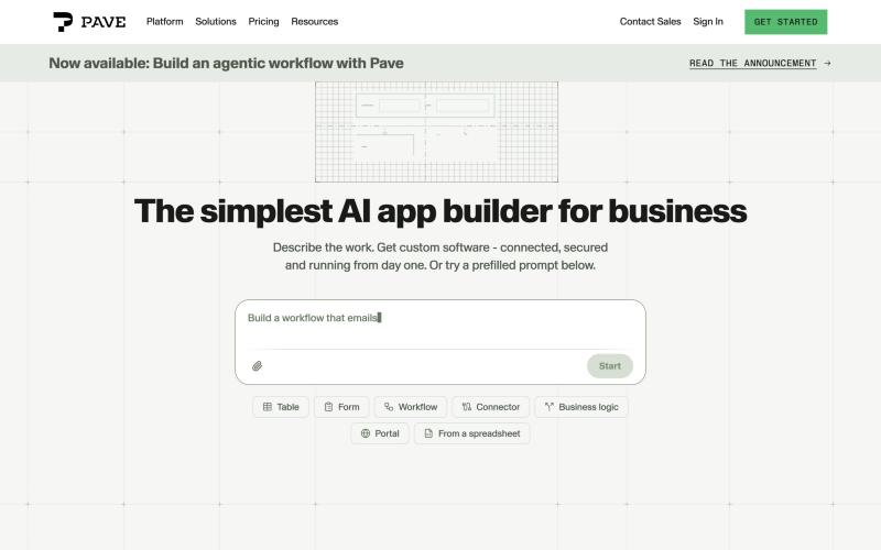
WebsiteLiveThe quickbase.com/pave hero, built by the web team from my package.
ProductLiveWhere "Sign in" lands.
What I'd keep
- Design in code and hand over decisions. That's why each merge took days, not weeks.
- Structure before palette. Solving light mode with existing colours made it cheap to approve and easy to carry into dark mode.
- Audit every page, not only the ones with a design to compare against.
Still open: the wider error family and the phone layout are designed and waiting, and until someone measures it, I can say people liked it, not what it changed for the people who use Pave.
Related work
Designing Pave covers the builder, Plan Mode, Direct Edit and navigation that this home page now sits in front of.