Four characters
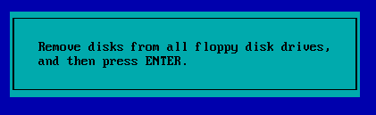
Remember these interfaces? Maybe not as well as I do. I have vivid memories from my earliest childhood of looking at DOS interfaces on our first family computer, and of watching my uncle, a programmer, at work. I remember how interested I was in how simple characters like a slash, a backslash and a dash could animate a loading state with such ease. Or three dots. Our computer took so long that I'd stick my face into the CRT monitor while I waited, watching the different loading states.
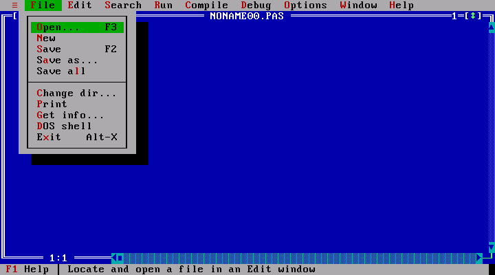
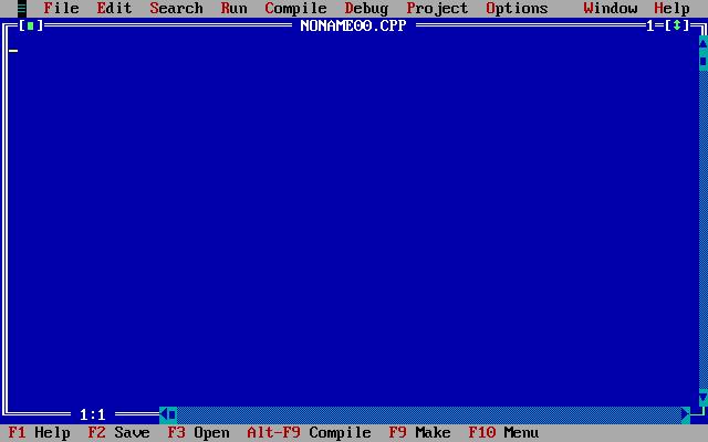
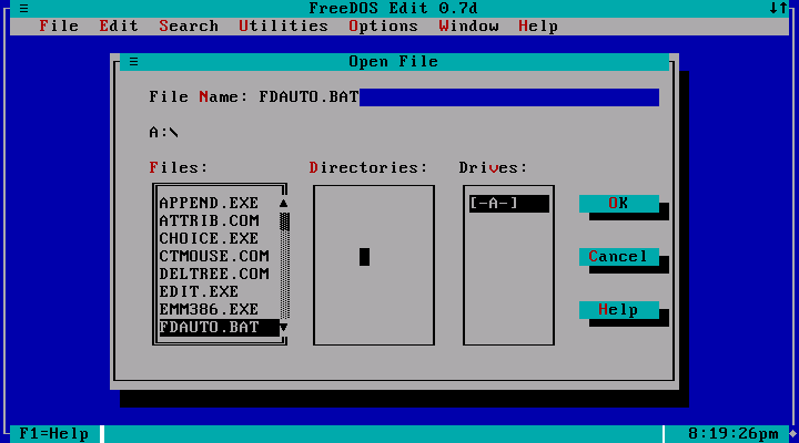
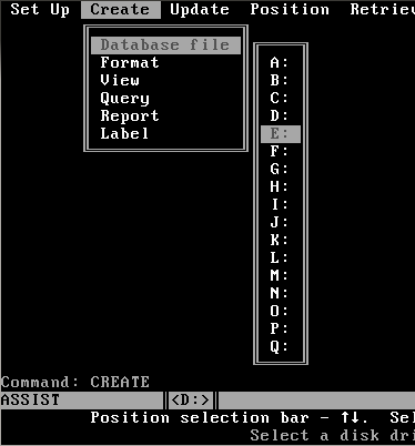
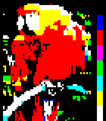
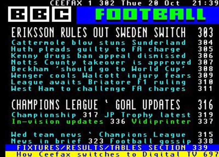
I also remember watching teletext, waiting for the pages to show their graphics, and the patterns they drew with the same simple block glyphs this note is about.
Shortly said, I've been observing user interfaces since I was the same age my kids are now. And as with everything in human nature, especially fashion, it's circular. We've reached the pinnacle of UI, and anyone can generate whatever they want. There's almost no limit to how interfaces can look and feel. But for some reason we're looping back to where interfaces began. Text.
░ ▒ ▓ █
Light, medium, heavy, full. Plus the empty cell.
I've been dabbling with ASCII aesthetics for close to a year and a half now, and I discovered that outside of the legibility and the whole amazing vibe of it, there is an actual deep use case for why glyph-based deliverables are of extreme use in the age of AI.
In January 2025 I started on the visual language of synapsys.ai, and in April I scrapped my portfolio redesign and did it for myself. These four characters have been in almost everything I've made since: the product, slides at work, audits, sketches, a personal project about saints.
Why text
Most of my documents are now Markdown or MDX. They're reviewed as diffs and read by coding agents, and sometimes by people. When one has to reach a non-technical audience, I quickly convert it and wrap it in another format, like a PDF or an HTML page.
A text diagram survives all of that. It shows up in a diff as a shorter bar, pastes into a ticket or a PR comment, is generated from data at build time, and a model reads the number next to the bar exactly instead of estimating it from a picture. Wrapped in a PDF or a page, it's still the same drawing.
In the product
For v1 of synapsys.ai I used black, one phosphor accent and ░▒▓ as the only fills. The idea behind it was a very animated, living, responsive look, terminal-esque, that combines glyphs and terminal-style interactions and motion with modern tooling.
One of the places it turned out best was the skeleton animation variants. Each kind of operation steps through the same ramp differently: expand reveals from the centre, synthesize resolves noise into heavier blocks, summarize steps back toward empty, compare alternates density between two halves. That's what sent me further down the rabbit hole of ASCII-fying the world.
In decks, audits and handoffs
A budget case for my AI usage, written as a terminal session. Measured months are █, the rest of the current month is ░ at the current pace. The whole deck is one 15 KB HTML file.
Jul ███████                               1.0×
Aug █████████████████                     2.3×
Sep ██████████████████████████████        4.1×
Oct ██████████████████░░░░░░░░░░░░░░░░░░  on pace for ~5×
░ = projected at the current pace
Usage as an index of July. The real figures stay private.
A motion audit of Pave's front end: about 750 transitions and animations in about 350 stylesheets, 47 proposed fixes. Each finding got a duration ruler (20 cells, 25 ms each) and an eight-character speed glyph. The speed glyph shows that the browser's default ease speeds up before it slows down.
today    ▕████████············▏ 200ms  ease         ▅█▇▅▄▃▂▁
proposed ▕██████··············▏ 150ms  reveal-ease  █▆▅▄▃▂▁▁
         0·········250········500ms
A handoff to our marketing team, who had built a hero animation from the product's grid. Theirs moved all the time; the product's mostly holds still. I recorded both for 60 seconds, logged every line position per frame, and sent this:
MEASURE                CURRENT HERO      PRODUCT
vertical lines moving  ██████████ 100%   ██░░░░░░░░ 23%, in 17 pushes
row lines moving       ░░░░░░░░░░ 0%     █░░░░░░░░░ 11%
a drawing's build      ███░░░░░░░ 2.7 s  ████████░░ 7.7 s
a drawing's exit       █░░░░░░░░░ 0.8 s  █████░░░░░ 4.6 s
The ░ keeps the empty part of the scale visible, so 0% reads as an empty bar and not a missing row.
And diagrams for arguments rather than numbers. This ledger from The price of pace is also in my slides at work: expertise earns trust, trust powers pace, time keeps it going, pace delivers craft. Next to it are five other versions of the same argument, drawn and animated in characters before I settled on the ledger.
We pay with expertise and time. Expertise earns trust, trust powers pace, and we spend time keeping the pace. Pace delivers what we get: craft, quickly.
In sketches
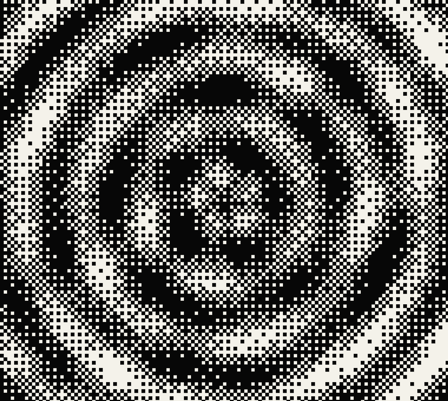
In the creative coding studies the blocks are the image. Up close you read the marks; from a distance, the shape.
The waves are blank space and ░▒▓ only, without █. Six trochoidal waves give height, reflection and foam, and the shader dithers each cell only between neighbouring states, so a gradient never skips from ░ to ▓. Our Saints is a personal editorial project about Bulgarian Orthodox saints: each icon sits under a layer of gold blocks, and moving across it uncovers the image beneath.
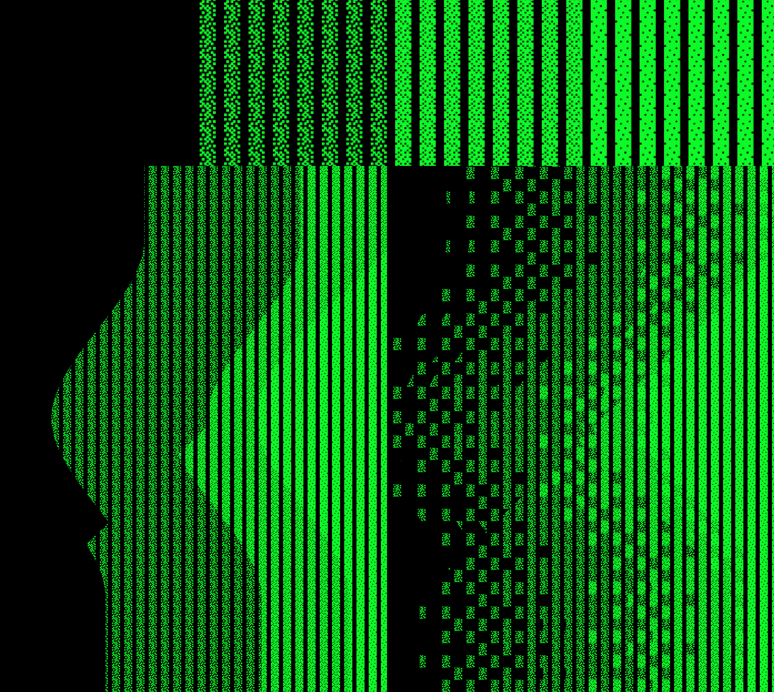
░, ▒ and ▓.Where they come from
The characters are old. I'm late. IBM's PC character set, code page 437, put ░▒▓ at bytes 0xB0–0xB2 and █ at 0xDB in 1981, next to single and double box-drawing lines. In the 8 × 16 VGA font the shades are ordered dither patterns: 2 of every 8 pixels, a checkerboard, 6 of every 8.
░ 25%        ▒ 50%        ▓ 75%
···█···█     ·█·█·█·█     ██·███·█
·█···█··     █·█·█·█·     ·███·███
···█···█     ·█·█·█·█     ██·███·█
·█···█··     █·█·█·█·     ·███·███
From the VGA font in the Linux kernel source, one character per pixel.
Before the PC, teletext did pictures the same way. BBC Ceefax started in 1974, and every cell on screen held either a character or a 2 × 3 block mosaic, like the pages at the top of this note.
The Commodore PET (1977) had half blocks, quarter blocks and a checkerboard in PETSCII. BBS artists in the 80s and 90s shaded ANSI art with the same code page 437 blocks. Unicode took the box and block characters in at version 1.0 in 1991, and in 2020 added Symbols for Legacy Computing so teletext and PETSCII graphics can be written as text.
Text-mode software
In text mode a PC screen is a grid of 80 by 25 cells. Each cell holds one character from the code page, plus a foreground and a background colour, and that's all a program has to draw with. So whole interfaces were built from the character set:
- Windows, panels and dialogs framed in the single and double box-drawing lines.
- Desktops filled with
░or▒, so windows read as sitting on top. - Scroll bar tracks in
▒, with a■for the thumb. - Shadows under buttons from the half blocks
▄and▀. - Progress bars and meters filling cell by cell with
█.
Borland's Turbo Vision (1990), the framework behind the Turbo Pascal and Turbo C++ IDEs, did all of it: the desktop is ░, scroll bar tracks are ▒ with a ■ thumb, and button shadows are half blocks. Every DOS screen at the top of this note is text, not a picture.
Terminal apps still draw this way, and tqdm progress bars and spark sparklines still use the blocks. It's the same reason I use them now: a picture made of characters is text, so a model can read it, write it and diff it.