← All labsOpen source · 10 skills · MIT

Presentations
in code.

Camera moves, live annotations and exploded views. Built on the interface itself.

Try the techniques here. Take the skills and use them on your own screen.

One component. Two states.
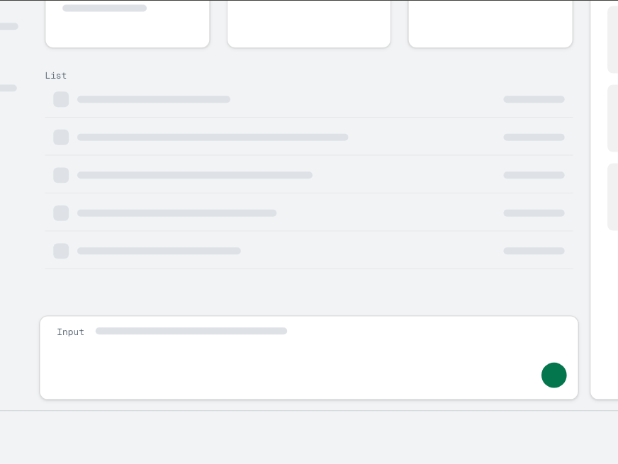
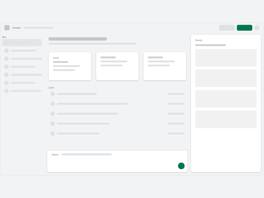
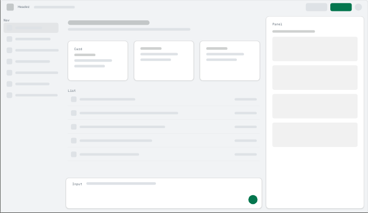
The original live blueprint interface, with its header, navigation, cards, panel and input.
Click a part of the screen to switch Before / After. The same elements change together.How the comparison works ↗

01 / Start with the argument

One point per beat.
One real screen underneath.

The plan chooses what the audience needs to notice. The setup keeps every technique connected to the same component.

Deliverable / the plan01 · Planner skill ↓
  1. 01

    Show the change

    One screen, before and after.

    compare
  2. 02

    Bring it closer

    Move to the part being discussed.

    camera
  3. 03

    Explain the structure

    Separate the surfaces into levels.

    explode

Three beats from the techniques in this tutorial. The planner proposes the sequence before building it.

Deliverable / the host02 · Setup skill ↓
your screen component<Screen />
  • Cameranamed stops
  • Anchorslive bounds
  • Layersreal surfaces
Every state has an address#making-of?slide=7&step=4 ↗

The reference deck includes URL steps, shared timing tokens and a reduced-motion mode.

02 / Direct attention

Move the camera.
Keep the screen.

Each stop frames a measured rectangle in the same interface. Move between them and keep enough context to know where you are.

Click Input, Panel or Cards on the screen. Use Whole screen to return.

03 · Camera zoom skill ↓
Camera stops
A camera framing the original blueprint screen; named stops focus its input, panel and cards.
Input · x 200 / y 324 / 880 × 509One world transform

03 / Point at the live element

The note follows
the interface.

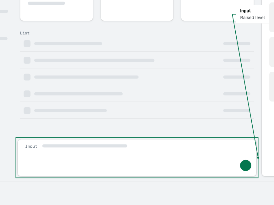
The ring comes from the element’s actual bounds. The leader tracks that ring while the live interface changes.

Click a component to attach its note. Use the in-screen switch: the input changes height, and the note follows.

04 · Live anchors skill ↓
What usually goes wrong

A stored rectangle becomes wrong when the component moves. Track rendered bounds during the transition and measure again when the element or viewport changes.

Measured live anchorSelect on the screen ↓
A live ring and leader line attached to the changing input on the original blueprint screen.
Live component → measured ring → leaderClick Input, Panel or Cards to move the note.

04 / Open the interface

One screen.
Four planes.

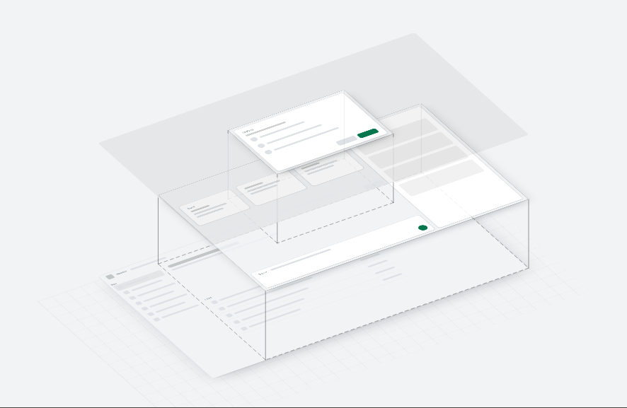
Tag the surfaces, copy each level, tilt the view, then lift the planes apart. The blueprint is measured from those same surfaces.

The original surface stackSelect a surface ↓
The original screen separated into background, raised surfaces, dimmer and dialog planes.
Exploded: the tagged surfaces are separated, with measured lines back to the ground.
L0 Background / header, navigationL2 Raised / cards, panel, inputL3s DimmerL3 Floating / dialog

05 / Check what changes

Before and after.
On one screen.

Switch between states. The same component changes its surfaces, spacing and emphasis. Show the moving bounds, then inspect the transition.

09 · Before / after skill ↓
Live comparison
A reversible before-and-after comparison on the original blueprint interface.
One component. Measured movement, rather than two unrelated pictures.

06 / Take the techniques

Ten skills.
Your own screen.

Start with presentation-planner. Each skill proposes its plan before building. The files below are the original skills, unchanged.

Install for Claude Code

Copy the skill folders into ~/.claude/skills/ for every project, or .claude/skills/ inside one project.

01

Plan the argument

presentation-planner

Turn a design argument and a real screen into a sequence of beats.

Use it when you know what needs explaining, before building the presentation.

You get a slide plan: one point, one demonstration and one technique per beat.

See the result ↑
Read & copy skill
---
name: presentation-planner
description: Use when someone wants to turn a design argument about a real interface into an interactive presentation in code; it picks which techniques go on which slides, in what order, and hands each slide to the right skill.
---

# Plan an interactive presentation

Turn a topic and a real screen into a slide plan, where every slide proves one point with a live demo, then build it with the other skills in this set.

## Ask for these first

1. The argument, in one sentence. What should the audience believe or decide at the end?
2. The audience, and how long they have.
3. The real screen or component the presentation is built on, and where its code lives.
4. The elements worth featuring: the two to five parts of the screen the argument depends on.
5. The before and the after, if the argument is a change: what exists today, and what is proposed.
6. The brand tokens: colours, type, spacing, motion durations.

Do not start planning until you have at least 1, 3 and 4.

## Plan first, then wait

Write the slide plan as beats, not as slides with decoration. For each beat give:

- the point it makes, as one plain sentence (this becomes the heading);
- the live demo that proves it, and which skill builds it;
- what the viewer does on it, if anything (point, press, switch);
- how many steps it has, and what changes on each.

Order the beats so the deck leads up to the point and then reveals it:

1. Open on the real screen, moving: show the result before explaining it.
2. Name the problem on the screen as it is today, pointing at it (camera-zoom, live-anchors).
3. Show the structure underneath (layer-tagging, orthographic-breakdown, level-pointing, blueprint-mode).
4. Reveal the change on the same screen (one-screen-before-after), one group at a time if it has several.
5. End on the decision you want, with nothing moving.

Use each technique only where it carries the argument. A deck with every technique on every slide proves nothing.

Present the plan and wait for approval. Change it as asked. Only then build.

## Build

1. Run coded-presentation-setup first, with the approved slide list.
2. Build the slides in order, one skill per demo. Each skill plans its own details (stops, targets, levels) against this plan before building.
3. After each slide, capture every step and look at it.
4. Run frame-check over the whole deck before calling it done.

## Rules

- One point per slide. The heading says it as a plain declarative sentence, in sentence case.
- Every demo runs on the real screen component, never a picture of it.
- Nothing changes by itself after the opening. The viewer or the presenter causes every change.
- Every step can be reached from its URL.

## Acceptance checks

- Read the headings in order, alone: they make the argument without the demos.
- Each demo, removed, would leave its slide's point unproven.
- frame-check passes on every slide and step.

## Common failures

- Planning slides before the argument is one sentence. Get the sentence first.
- Using a technique because it is impressive, not because a beat needs it.
- Revealing the change before the audience has seen the problem.
- A final slide that moves. End still, on the decision.
02

Build on the real screen

coded-presentation-setup

Set up the host every technique below depends on.

Use it when the plan is ready and the real screen component is available.

You get a deck with addressable steps, shared motion tokens and reduced motion.

See the result ↑
Read & copy skill
---
name: coded-presentation-setup
description: Use at the start of any presentation built in code on a real interface, to set up the deck on the real screen, the slide registry, steps in the URL, motion tokens and reduced motion before any slide is built.
---

# Set up a presentation in code

A deck host that every technique in this set depends on: your product's real screen component, on a slide that scales as a whole, with every step addressable and every duration a token.

## Ask for these first

1. The screen component to present, and the props that put it in each state you need.
2. The slide list as beats (from presentation-planner, or written now): one point per slide.
3. The brand tokens: type, colours, spacing, and any existing motion durations and curves.
4. Where the deck should live in the codebase, and its route.

## Plan first, then wait

Propose, and wait for approval:

- one fixed size for the screen and one for the slide, picked to suit your screen and your talk;
- the slide list as beats, each with its heading, its demo and its step count;
- the motion tokens the deck will define, with values;
- the route and the URL shape (#your-deck?slide=N&step=M).

## Build

1. A deck host component. Pick one fixed size for your screen and one for the slide, then scale: the host lays every slide out at the slide's size and fits it to the window with one transform, scale = min(window width / slide width, window height / slide height). Nothing on a slide is ever laid out in window pixels.
2. A slide registry: an array of slides, each with a slug, a title, a step count and a component. A slide component receives { step, active, advance }.
3. Routing in the URL hash. The arrow keys, space and Page Up / Page Down move one step at a time; Home and End jump to the ends; a click on the left third goes back, elsewhere forward. The hash always names the current state.
4. The screen component at its fixed size wherever it appears, scaled with a transform. Never let it reflow to the slide or the window.
5. Motion tokens: every duration and easing as a custom property on the deck root, read by CSS and by script alike.
6. Reduced motion: data-motion="reduce" on the root, set from prefers-reduced-motion or ?motion=reduce, which sets every duration token to 0ms.
7. Neighbour slides mounted in the background, hidden, once the current slide has settled, so a slide change is a fade between two mounted slides.

## Rules

- Animate transform and opacity only.
- A control inside a slide handles Enter and space itself; the deck's keys leave it alone. A list that uses up and down arrows marks itself so the deck leaves those keys too.
- A slide that is not on screen never animates, and is put back to its starting state once it is hidden.
- Tab only reaches the current slide's own controls, never the screens or the hidden slides.

## Acceptance checks

- Every slide and step loads directly from its URL.
- With ?motion=reduce every step is reached in one paint.
- No main-thread task over 50 ms on any step change.
- The first painted frame of every slide is already at its final scale.

## Common failures

- Laying out the screen at the window's size: every measurement then changes with the window.
- Keeping steps only in memory: a reload, a link and a screenshot script cannot reach them.
- Literal durations in components: reduced motion cannot turn them off.
- Mounting the next slide on the key press: the first frame of every slide change stutters.
03

Direct the camera

camera-zoom

Move between measured parts of one live screen.

Use it when the audience needs a closer look without losing the surrounding interface.

You get named camera stops and one continuous transform between them.

See the result ↑
Read & copy skill
---
name: camera-zoom
description: Use when a slide needs to look closer at parts of a live screen in a coded presentation; it plans the camera stops from the story, then builds a camera that flies between them with one transform.
---

# Camera zoom

One live screen, and a camera that flies between named stops on it. The screen never changes; one element's transform does.

## Ask for these first

1. The screen component and the state it should be in.
2. The beats on this slide: what the audience should notice, in order.
3. The elements to feature, by name or selector.
4. How the viewer moves the camera: deck steps, pointing at a list, pressing buttons, or a mix.

## Plan first, then wait

Propose the stops, one per beat, and wait for approval:

- each stop's name, the element it frames, and the point it makes;
- its rectangle in the screen's own pixels (x, y, width, height), measured from the live screen, with enough of the surroundings to give context (a zoom of about 1.6 to 2 times);
- the order of the stops, and what drives each move.

## Build

1. A camera component: a viewport with overflow hidden, and inside it one world element at the screen's fixed size, holding the screen. The camera is the world's transform and nothing else.
2. Stops as constants: { id, x, y, w, h } in screen pixels. The whole screen is { 0, 0, screen width, screen height }.
3. The transform for a stop: scale = min(viewport width / w, viewport height / h); translate so the stop's centre lands on the viewport's centre.
4. One duration token and one easing token for every flight.
5. From one stop to the next, go straight there.
6. If stops follow the pointer, wait about 80 ms after the pointer settles before moving.

## Rules

- Measure the viewport before the first paint, and keep the camera hidden until it has a real size.
- Re-fit only when the viewport itself resizes, never when the content inside it changes.
- Anything drawn on a stop (a ring, a label) is measured after the flight has ended.
- Transform only. Never animate width, height, top or left.
- Reduced motion lands on each stop in one paint.

## Acceptance checks

- Record every frame of each flight: no jump, no snap, and the first frame is at its final scale.
- A quick sweep of the pointer across all the stops does not move the camera.
- Every stop frames its element with its surroundings visible.

## Common failures

- The camera jumps when the content inside it changes: it is re-fitting on content changes.
- The first frame paints at the wrong scale: the viewport was measured after paint.
- The camera thrashes as the pointer crosses the stops: no debounce.
- An overlay lands in the wrong place: it was measured during the flight.
- The camera zooms out and back in between two stops: it should pan straight across.
04

Attach the explanation

live-anchors

Tie the ring and leader line to the element being discussed.

Use it when the interface can move or change while a note points at it.

You get an annotation measured from the live element after the camera settles.

See the result ↑
Read & copy skill
---
name: live-anchors
description: Use when a slide needs to point at a live element and explain it in a coded presentation; it adds a ring measured from the real element and a leader line to a note card that follows the element through every change.
---

# Live anchors

A ring round a live element, and a leader line from it to a note that explains it. The ring is measured from the element, never placed by hand.

## Ask for these first

1. The elements to anchor, by selector, and the state of the screen for each.
2. What each note says: the element's name, and one sentence on why it matters.
3. Whether a camera stop frames each element (camera-zoom), and what changes the element while it is anchored.

## Plan first, then wait

Propose, and wait for approval:

- which element is anchored on which step, and the note for each;
- where the note column sits beside the screen, so the card never moves;
- what the viewer can change while the ring shows, and that the ring will follow.

## Build

1. An overlay: an SVG over the camera viewport, in the viewport's own pixels, with pointer-events none.
2. After the camera has settled (its duration token plus one frame), read the target's rect with getBoundingClientRect.
3. Convert it to the overlay's coordinates: subtract the overlay's own rect, then divide by the slide's scale (the overlay's on-screen width divided by its layout width).
4. Draw the ring as a rounded rectangle about 5 px outside the element, clipped to the viewport.
5. Draw the leader from the ring's nearest edge to the note card, which always sits in the same place in a column beside the viewport.
6. Re-measure after every change to the screen (once its animation has ended), after every camera move, and on resize. Hide the ring while it re-measures, then draw it back in.

## Rules

- Never measure during a camera flight or a layout animation.
- The ring and the line draw in with opacity and stroke-dashoffset on duration tokens.
- The note names the element and says why it matters, in one short sentence.
- Reduced motion draws the ring and the line in one paint.

## Acceptance checks

- At every stop, at two window sizes and in light and dark, the ring sits within 1 px of its offset from the element.
- Change the screen while a ring shows: the ring follows the element and never points at its old place.

## Common failures

- The ring sits 20 px off: it was measured mid-zoom.
- The ring is right at one window size and wrong at another: it was not divided by the slide's scale.
- The ring points at where the element used to be: it was not re-measured after a change.
- The note card jumps from stop to stop: give it one fixed place and move only the line.
05

Name the surfaces

layer-tagging

Give every visible surface the level it actually occupies.

Use it when you need to explain depth, nesting or the structure of a screen.

You get data-layer tags on the real component, ready for extraction.

See the result ↑
Read & copy skill
---
name: layer-tagging
description: Use before building an exploded view, x-ray or blueprint of a screen in a coded presentation; it tags every surface root of the screen component with the level it sits on, from one ordered list of levels.
---

# Layer tagging

One attribute on every surface root of your screen component, naming the level it sits on, so a presentation can take the screen apart.

## Ask for these first

1. The screen component, and the states it is presented in.
2. The levels of your design system, bottom to top. If there are none yet, propose a short list: for example L0 background, L2 raised, L3s dimmer, L3 floating.
3. The design tokens for one colour per level, for the x-ray.

## Plan first, then wait

Propose, and wait for approval:

- the ordered list of levels, each with a short id and a plain name;
- every surface on the screen and the level it sits on, as a table (surface, element, level);
- any surface that seems to need two levels, and how to split it.

## Build

1. Export the ordered list of levels from one file. Every other view (x-ray, exploded view, labels) reads it.
2. Put data-layer="<id>" on the root element of every surface: the element that paints the surface's background, edge and shadow. Never on the content inside it.
3. Add an x-ray mode to the screen component: every [data-layer] element gets an outline in its level's colour and a small label with the level's name.
4. Write a small script that lists every [data-layer] element and its level.

## Rules

- One level per surface.
- The tags change nothing about the normal screen's layout or paint.
- The x-ray's outlines must not shift layout: use outline, not border.
- Colours come from your tokens, one per level.

## Acceptance checks

- In x-ray mode every visible surface is outlined once, and nothing is outlined twice.
- The script's list matches the approved table.

## Common failures

- A surface tagged twice shows up on two levels later.
- A tag on content rather than on the surface that paints it: the exploded view lifts the text without its card.
- Each view keeps its own list of levels, and they drift apart.
06

Open the stack

orthographic-breakdown

Separate the real screen into CSS 3D planes.

Use it when flat pixels conceal how the interface is assembled.

You get a flat-to-exploded view with the original screen on every plane.

See the result ↑
Read & copy skill
---
name: orthographic-breakdown
description: Use when a slide should show how a screen is built from levels in a coded presentation; it plans which screen and which levels tell the story, then explodes the live screen into levels with CSS 3D, step by step.
---

# Orthographic breakdown

The live screen lifts apart into its levels, with no perspective: flat, swap in one copy per level, tilt, rise, then drop lines and footprints.

## Ask for these first

1. The screen component, tagged with layer-tagging (run that skill first if it is not).
2. The point the breakdown makes: which levels matter, and what the audience should notice about them.
3. The steps the slide needs: the whole build-up, or only the final view.
4. The tokens for the tilt, the gap between levels and the durations.

## Plan first, then wait

Propose, and wait for approval:

- which screen state is exploded, and which levels become sheets (merge or drop the ones that do not serve the point);
- the steps, one per stage, with the caption for each;
- the tilt, the gap and the scale, so the lifted stack fits the slide.

## Build

1. A stage component showing one live copy of the screen, flat.
2. Behind it, one copy of the screen per level at the same place. Each copy shows only its own level: [data-layer] elements of other levels are hidden with visibility, not removed. Mount the copies one per frame after the stage has painted.
3. Swap: hide the live screen and show the copies while everything is flat. They are identical, so nothing changes on screen.
4. Tilt: one transform on the copies' parent, for example rotateX(56deg) rotateZ(-32deg), with transform-style: preserve-3d and no perspective.
5. Rise: each level moves up on translateZ by its index times the gap token, bottom level first, each a little after the one below.
6. Once every level has settled, read each sheet's projected corners from small marker elements at its corners, and draw drop lines to the level below and each sheet's footprint in one flat SVG over the stage.
7. Collapse runs the same stages backwards; the live screen takes over only when everything is flat again.

## Rules

- Never crossfade the live screen into the copies. Swap them in at the same place while flat.
- Every element between the stack's root and the planes keeps preserve-3d, with no overflow, filter or opacity below 1.
- Labels and lines live in a flat SVG over the stage, never on the tilted planes.
- Durations, the tilt and the gap are tokens. Reduced motion shows each stage's end state in one paint.

## Acceptance checks

- No frame shows two copies of the same text.
- No task over 50 ms while the copies mount or while the stack lifts.
- The drop lines meet every sheet's corners within 1 px.
- Walking the steps backwards collapses the stack the same way it rose.

## Common failures

- Text shows twice during the swap: the live screen was crossfaded.
- The page freezes when the slide opens: every copy mounted at once.
- The levels flatten into one plane: an element in between lost preserve-3d.
- Labels blur on the tilted planes: draw them flat over the stage.
07

Inspect one level

level-pointing

Lift a chosen level and quiet the surrounding planes.

Use it when one surface or component needs a focused explanation.

You get level and component targets with lift, dimming, leaders and a closer view.

See the result ↑
Read & copy skill
---
name: level-pointing
description: Use when the audience should explore an exploded screen in a coded presentation; it adds hover and focus on each level and part, which lifts it, dims the rest, draws a leader to its card and zooms the stage onto it.
---

# Level pointing

Point at a level of an exploded screen, or at a part on it: it lifts, the rest dim, a line leads to its card, and the stage zooms onto it.

## Ask for these first

1. An exploded view built with orthographic-breakdown.
2. The parts on each level worth explaining, and one sentence on why each sits where it does.
3. Whether the viewer uses the pointer, the keyboard or both (plan for both).

## Plan first, then wait

Propose, and wait for approval:

- the list of levels and parts the viewer can point at, with each card's text;
- the column beside the stack that holds the list and the card;
- the zoom limit (about 1.8 times) and the dim (about 20 percent).

## Build

1. After the stack has settled, build one SVG polygon per level from its projected corners, and one per part from the part's box mapped through the level's corners, as hit areas.
2. On hover or focus of a level: lift it by a small token (about 12 px) on translateZ; dim every other level to about 20 percent opacity. Focusing a part outlines it too.
3. Draw a leader from the focused shape to the card in the column. The card names the level or part and says why it sits there.
4. Zoom: one translate and scale on the stage's container that brings the focused shape to the middle of the stage, and back out when nothing is focused.
5. A list of the levels and parts in the column does the same on keyboard focus; the up and down arrows move through it.

## Rules

- Debounce pointer moves by about 80 ms.
- Ignore pointer-enter events caused by the stage moving under a still pointer; react only if the pointer itself moved in the last few frames.
- Lift, dim and zoom use transform and opacity only, on duration tokens.
- The leader draws once the zoom has settled.

## Acceptance checks

- Sweeping the pointer across the stack never makes it shake.
- Every level and part can be reached with the keyboard alone.
- Every leader ends on its shape after the zoom.

## Common failures

- The stack shakes under a moving pointer: no debounce.
- The zoom causes a chain of hovers: pointer-enter events from the stage moving.
- Hit areas miss the tilted levels: they were built from the flat screen.
08

Look through the paint

blueprint-mode

Show the measured structure of the same surfaces.

Use it when spacing, nesting and level membership matter more than appearance.

You get wireframe boxes that remain attached to their own planes.

See the result ↑
Read & copy skill
---
name: blueprint-mode
description: Use when a slide should show a screen's structure rather than its paint in a coded presentation; it adds a switch that fades the rendered surfaces of an exploded or flat screen to wireframe boxes on their levels.
---

# Blueprint mode

A switch that fades the painted surfaces away and draws each one as a box on its level, so the audience sees structure, not paint.

## Ask for these first

1. The screen component, tagged with layer-tagging, and ideally exploded with orthographic-breakdown.
2. What the blueprint should make visible: nesting, spacing, which level each box sits on.
3. The ink tokens for the boxes in light and dark.

## Plan first, then wait

Propose, and wait for approval:

- which step or control turns the blueprint on;
- which boxes are drawn and labelled, and which are left out;
- the stroke weights per level (heavier for higher levels).

## Build

1. While the screen is flat, measure every tagged surface's box once, relative to the screen root.
2. On every level, draw its boxes as an SVG in that level's own plane, so they tilt and rise with it.
3. A switch with two real buttons fades the painted copies down and the boxes up, together, on one duration token.
4. Keep the sheets' outlines and the drop lines in both modes.

## Rules

- Measure the boxes from the same state the copies show.
- Fade with opacity. Never use display none on either side.
- The box ink comes from tokens that flip with the theme.
- Reduced motion switches in one paint.

## Acceptance checks

- In every frame of the switch, each box sits on its surface.
- The switch is reachable with Tab and reports its state with aria-pressed.

## Common failures

- Boxes that do not sit on their surfaces: measured from a different state.
- A jump instead of a fade: display none somewhere.
- Boxes that vanish in dark mode: hard-coded ink.
09

Make the change visible

one-screen-before-after

Compare two states without replacing the screen.

Use it when a design change needs to be seen in place.

You get a reversible switch on one live component, with measured FLIP transitions.

See the result ↑
Read & copy skill
---
name: one-screen-before-after
description: Use when a coded presentation compares a current design with a proposed one; it splits the change into named groups on one live screen and animates every switch with a FLIP, so before and after are one screen with a switch.
---

# One screen, before and after

One live screen and a switch. The change is split into named groups; each switch moves the screen's own elements from one state to the other, both ways.

## Ask for these first

1. The screen component, and the before and after designs.
2. The differences between them, as a list.
3. Where the comparison appears: the whole screen, or a camera stop (camera-zoom) on one part.
4. Whether the change should land all at once or one group at a time.

## Plan first, then wait

Propose, and wait for approval:

- the change as named groups (for example depth, edges, emphasis), each with what it changes;
- which slides show which groups, and what each switch covers;
- whether any slide lands the groups one at a time, and in what order.

## Build

1. The screen component takes a list of groups and writes it as one attribute on its root: data-fix="depth edges". Every new style keys off that attribute.
2. Every element that exists in both states carries the same id: data-morph="input". Duplicate ids get an index.
3. A FLIP on every change: right before the new state is committed, record the rect of every [data-morph] element; right after, before the paint, record them again; then animate each from the old rect to the new one with transform. An element only the new state has fades in; one only the old state had fades out from a copy.
4. A switch with two real buttons (Before and After) changes the groups. The change animates both ways on the same elements.
5. Run the re-render as a low-priority update (a React transition, for example) so no task goes over 50 ms.

## Rules

- Nothing changes back by itself. The only reverse is the one right after the viewer presses the switch.
- Never crossfade two whole screens.
- Never wipe a region with clip-path.
- Reduced motion lands each state in one paint.

## Acceptance checks

- Record every frame of both directions: each word appears once in every frame, and no region goes blank.
- A log of data-fix never shows a group switching off unless the switch was pressed in the last 400 ms.

## Common failures

- The screen flashes back and forward (1, 0, 1): something reverts on a timer.
- Every word shows twice for a moment: two screens crossfaded.
- A region goes blank under a moving edge: a clip-path wipe.
- A long task on every switch: the re-render was not a low-priority update.
10

Check the transition

frame-check

Inspect frames while the demonstration runs.

Use it when the final state looks right but the transition may still jump or duplicate text.

You get frame timing, long-task counts and overlapping-text checks to investigate.

See the result ↑
Read & copy skill
---
name: frame-check
description: Use whenever anything moves in a coded presentation, before it is shown; it writes and runs a probe that records every animation frame of every step and fails on doubled text, reverts, blank regions, long tasks and a wrong first paint.
---

# Frame check

A probe that records every animation frame while each step plays, and fails on what the eye would catch.

## Ask for these first

1. The deck's URL and how a step is addressed (for example #your-deck?slide=N&step=M).
2. The list of slides and steps that move, and the controls on each.
3. The regions that must never be blank (the screen's main parts).

## Plan first, then wait

Propose, and wait for approval:

- the scenarios: one per animated step, one per control in each direction, and each slide change;
- the rules below, and any you would add for this deck;
- the window sizes and browsers it runs in.

## Build

1. A script (Playwright, for example) that opens each scenario from its URL, injects a probe, plays the step or presses the control, and records for about 4 seconds.
2. The probe runs on requestAnimationFrame and records, every frame:
   - doubled text: two elements with the same text, both above 0.3 opacity (counting every ancestor's opacity), in boxes that overlap. Boxes that match to the pixel are one element fading and count apart;
   - reverts: the screen's change groups shrinking when no switch was pressed in the last 400 ms;
   - blank regions: a required region with nothing visible;
   - long tasks over 50 ms, from a PerformanceObserver.
3. A screenshot at the first frame of each hit.
4. A separate check that the first painted frame of every slide is at its final scale.

## Rules

- Never change the deck to make a check pass. Report the hit and its likely cause.
- Run headless and in a visible browser: headless draws in software and makes paint look slower.
- Run at the slide's own size and at a window of a different shape.

## Acceptance checks

- Every scenario reports frames recorded, hits per rule, and the first three hits with a timestamp and a screenshot.
- The deck passes with zero hits on every rule.

## Common failures

- Checking only the last frame of each step.
- Sampling with a timer, which misses frames.
- Counting a copy at opacity 0 as doubled text.
- Trusting a headless run alone.